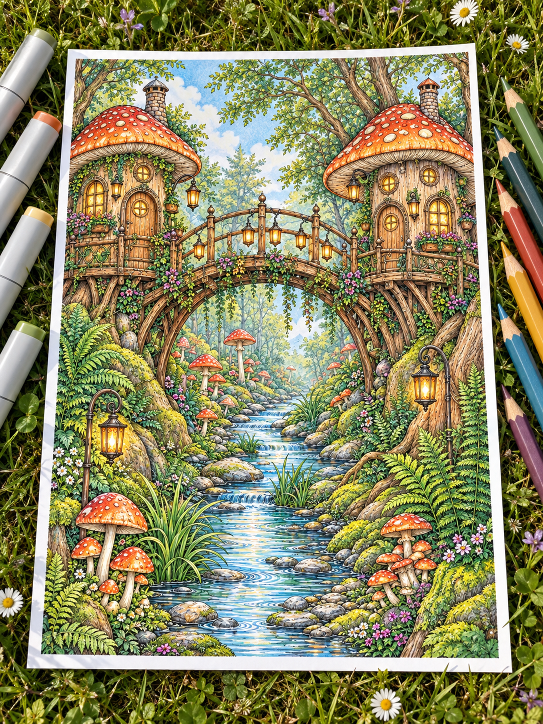
You’ve just finished applying a smooth alcohol marker base. The colors are bright, the larger areas look even, and most of the distracting white paper has disappeared… but the illustration still feels slightly flat.
You would love to add deeper shadows, realistic textures, and a few precise accents, but continuing to work the same areas with markers could oversaturate the paper, create dark overlap marks, or push the ink beyond the outlines.
This is exactly where colored pencils can transform your page.
Alcohol markers provide speed, smooth coverage, and vibrant color. Colored pencils offer control, texture, and precision. Used together, they make it easier to build depth without asking either medium to do everything. You don’t need expensive artist-grade supplies to try this technique. A modest marker set, a few useful colored pencils, and suitable printable paper are enough to get started.
This guide will show you how to combine alcohol markers and colored pencils, build simple mixed-media palettes, add controlled shadows and textures, and refine small imperfections without overworking your page.
1. Why Alcohol Markers and Colored Pencils Work So Well Together ✨
The two mediums have different strengths, which is exactly why they complement one another.
| Alcohol markers | Colored pencils |
|---|---|
| Cover large areas quickly | Add controlled shadows |
| Create smooth, saturated bases | Build fine textures |
| Fill the white paper efficiently | Refine small details |
| Establish the main palette | Strengthen edges and contact shadows |
| Add broad areas of light and shadow | Soften transitions with precision |
Think of alcohol markers as the foundation and colored pencils as the finishing layer.
The basic sequence is simple:
Alcohol marker base → complete drying → colored-pencil shading → final highlights
The marker layer establishes the main color and saves time on larger areas. Once that ink has dried, pencils can add shadows, texture, and small variations without requiring repeated marker passes. The goal is not to hide the markers beneath heavy pencil work. It is to let both materials remain visible and contribute something different.
2. Choose the Right Paper Before You Begin 📄
Combining markers and pencils requires a paper that can handle both wet ink and dry pigment.
You need a surface that is:
- Smooth enough for marker nibs to move comfortably
- Strong enough to withstand gentle pencil layering
- Slightly textured so the pencil can deposit pigment
- Compatible with your printer
- Thick enough for your preferred coloring process
Different papers behave in different ways:
| Paper type | What to expect |
|---|---|
| Standard copy paper | Affordable and printable, but absorbs ink quickly and offers limited durability |
| Smooth cardstock | A useful compromise between marker coverage and pencil texture |
| Marker paper | Excellent for marker blending, although some varieties may feel too slick for pencils |
| Smooth Bristol paper | Strong and suitable for layering, provided your printer can handle its thickness |
There is no single perfect paper for every combination of printer, marker, and pencil. Before printing a full collection, test one page or a small swatch.
Also remember that alcohol markers will usually bleed through most printable papers, including cardstock. Always place a protective sheet underneath your page. A plastic divider, silicone mat, or spare piece of thick cardstock can prevent ink from reaching your table or the next page.
Need more guidance on paper and printable pages? Read How to Use Alcohol Markers on Printable Coloring Pages.
3. Plan a Simple Mixed-Media Palette 🎨
You do not need a colored pencil that perfectly matches every marker.
In fact, a pencil may look different when layered over dried marker ink than it does on white paper. The marker base influences the final mixture, so swatching is especially useful with mixed media.
For each main color, try choosing:
- A light marker for the base
- A medium marker for broad shadows
- A darker pencil for depth
- A colored pencil with an atmospheric undertone
- An optional light pencil for soft transitions
Example: Forest Green Foliage
- Light sage marker
- Forest green marker
- Deep teal pencil
- Indigo pencil
- Pale sage or cream pencil
Test the full sequence on a scrap of the same paper you intend to use. Apply the markers first, allow them to dry, and then layer the pencils over them. This small step shows you whether the colors remain harmonious before you commit them to the finished illustration.
4. Start With a Light Marker Base 🖊️
One of the easiest ways to lose control of a mixed-media page is to make the marker layer too dark too soon.
Instead, keep the initial stage intentionally simple:
- Cover the object with your lightest marker.
- Leave small highlight areas uncolored or very lightly covered.
- Add a medium marker to the largest shadow areas.
- Avoid filling every narrow crevice with the darkest marker.
- Stop before the section looks completely finished.
The pencils will add the final depth later.
For example, when coloring green foliage, use a light sage marker across most of the leaves and forest green near their bases or beneath overlapping shapes. Save indigo, deep teal, and the smallest contact shadows for the pencil stage.
Stop the marker stage while the page still looks slightly simpler than you want.
This preserves room for texture, contrast, and gradual adjustments.
5. Let the Marker Ink Dry Completely ⏳
Allow the marker layer to dry before adding colored pencils. Working over damp ink can make the paper surface more vulnerable to pressure. It may also transfer ink onto the pencil tip or make it difficult to judge the true final color.
Drying time depends on:
- Paper thickness
- Number of marker layers
- Amount of ink applied
- Humidity
- Size of the colored area
A light marker layer may dry very quickly, while a heavily saturated background may need longer. Rather than following a strict timer, allow the page to rest until the color has settled and the paper no longer feels damp.
If an area still looks considerably darker than expected, give it another moment before adding more ink or beginning the pencil work. Alcohol markers often become slightly lighter and more even as they dry.
6. Add Shadows With Colored Pencils ✏️
Once the marker base is completely dry, begin building the pencil shadows with light pressure.
Hold the pencil slightly to the side rather than pressing with the sharp point immediately. Use small circular motions or strokes that follow the form of the object.
Concentrate the first pencil layers in natural shadow areas:
- Beneath roof eaves and gutters
- Between overlapping leaves or petals
- Inside fabric folds
- Under mugs, books, chairs, and plant pots
- Around the base of mushrooms
- Between stones and along riverbanks
- Behind objects placed close together
As you move away from the deepest part of the shadow, reduce the pressure so the pencil gradually fades into the marker base. The pencil should enhance the underlying color rather than cover it completely.
If the marker is still visible through the pencil shading, that is not a flaw. It is what allows the two materials to work together.
7. Use Colored Shadows Before Reaching for Black 🌌
Black can create strong contrast, but using it over every marker color may quickly make the page feel heavy.
Try using a darker colored pencil first:
| Marker base | Pencil shadow | Finished effect |
|---|---|---|
| Burgundy or crimson | Plum or deep violet | Velvety gothic red |
| Forest or olive green | Deep teal or indigo | Cool nocturnal foliage |
| Chestnut brown | Plum or navy | Rich antique wood |
| Burnt orange | Mahogany or deep rust | Warm autumn depth |
| Pale blue | Blue-violet or slate | Natural cool shading |
| Warm grey | Blue-grey or charcoal | Dimensional stone and brick |
Once the colored shadows are established, black can be reserved for a few deep contact points. This creates more variation than using black as the default shadow for every object.
For more guidance on deep palettes, read How to Make Dark Colors Rich Without Turning Them Muddy.
8. Create Texture Without Hiding the Marker Base 🌿
A smooth marker layer provides a useful foundation for pencil texture. The key is to add only the marks that help describe the material.
Wood 🪵
Draw a few broken lines following the direction of the grain. Add small knots and slightly darker marks near cracks, joints, or carved details. Avoid covering the entire surface with equally spaced lines. Natural wood contains variation and quieter areas.
Fabric 🧶
Follow the direction of the folds. Use soft strokes through the shadows and allow the broad marker base to remain visible across the lighter areas. Heavier fabrics can support deeper contrast, while blankets and soft clothing usually benefit from gentler transitions.
Stone 🪨
Add small irregular marks, subtle speckles, and a few short cracks. Darken the gaps between stones and introduce cooler pencil shades in recessed areas. The marks should remain uneven. Repeating the same pattern across every stone can make the texture feel artificial.
Leaves 🌿
Deepen the base of each leaf and add only the most important veins. Slight color differences can help overlapping leaves remain distinct.
Fur 🐾
Use short strokes that follow the direction of growth. Work in small clusters rather than drawing every individual hair. Concentrate the strongest contrast around the face, eyes, ears, and overlapping limbs.
Texture should describe the material—not hide the smooth marker color beneath it.
9. Soften Marker Transitions With Pencils 🌈
Colored pencils can make a marker transition feel smoother, particularly when the boundary between two shades looks slightly abrupt.
Choose a pencil close to the middle of the two marker colors. Apply it lightly across the transition using small overlapping strokes.
This can help:
- Reduce the appearance of a hard marker edge
- Disguise minor streaks
- Connect two similar colors
- Introduce a softer gradient
- Add texture that makes the transition feel intentional
However, pencils cannot completely erase a very dark marker patch or severe bleeding. It is better to think of them as a way to soften and integrate small imperfections rather than remove them entirely.
For larger uneven areas, see How to Color Large Areas Without Streaks or Patchy Marks.
10. Refine Small Edges and Imperfections 🛠️
Colored pencils are particularly useful for the small adjustments that are difficult to make with a broad marker nib.
You can use them to:
- Fill tiny white gaps near outlines
- Make a fuzzy edge appear cleaner
- Separate two similarly colored objects
- Restore a shadow beneath an overlapping shape
- Strengthen important contours
- Draw attention away from a minor marker bleed
If marker ink has crossed an outline, try strengthening the edge of the neighboring object with an appropriate pencil color. This will not remove the ink, but it can make the boundary look more intentional.
Avoid tracing every printed outline with the same dark pencil. Reinforce only the edges that need additional separation or belong to the focal area.
11. Add Highlights Only at the End ✨
After completing your marker and pencil layers, evaluate whether the page needs any final highlights.
Possible tools include:
- White or cream colored pencil
- White gel pen
- Fine acrylic paint marker
- A pale version of the local color
Use them for small accents such as:
- A reflection on glass or water
- The rim of a cup
- A glossy berry
- The edge of a wet stone
- A metal lantern
- Steam rising from a warm drink
- A narrow illuminated leaf edge
Colored pencils usually create softer highlights, while gel pens and acrylic markers produce more opaque marks.
Use white sparingly. If every leaf, stone, and wooden edge receives the same bright highlight, the page can lose its visual hierarchy and begin to look unnaturally glossy. Highlights are most effective when they lead the eye toward the focal point.
12. Know When to Stop Layering 🛑
Mixed media makes it tempting to keep adding “just one more layer.”
Watch for these warning signs:
- The pencil slides across a smooth, polished surface without depositing much pigment.
- The original marker base is almost completely hidden.
- Every texture has the same level of contrast.
- Shadows are losing their color identity.
- The paper surface is becoming damaged.
- Additional details make the section busier rather than clearer.
A shiny, sealed surface usually indicates that the paper has been heavily burnished or can no longer accept much pigment. This is different from wax bloom, which may appear later as a pale film on heavily layered wax-based pencils.
When you are unsure whether to continue, step away from the desk. Look at the page from a normal viewing distance or take a photograph with your phone. Small imperfections that seem distracting under a bright desk lamp often disappear when you see the illustration as a complete scene.
A Simple Marker-and-Pencil Workflow 📋
| Step | What to do |
|---|---|
| 1. Swatch | Test markers and pencils on the same paper |
| 2. Base | Apply a light marker color |
| 3. Broad shadows | Add a medium marker to the main shadow areas |
| 4. Dry | Allow the marker ink to settle completely |
| 5. Pencil depth | Build controlled colored shadows |
| 6. Texture | Add a few material-specific marks |
| 7. Deep accents | Strengthen contact shadows and narrow crevices |
| 8. Highlights | Finish with a few intentional light accents |
You do not have to use every stage on every object. A simple background may need only a marker base, while the main subject can receive more pencil texture and contrast.
Three Easy Mixed-Media Recipes 🎨
Cozy Autumn Wood 🪵
- Light ochre marker
- Chestnut marker
- Burnt umber pencil
- Deep plum pencil
- Cream pencil for illuminated edges
Use this combination for wooden bridges, bookshelves, doors, cabin interiors, and autumn furniture.
Moonlit Forest 🌲
- Pale sage marker
- Forest green marker
- Deep teal pencil
- Indigo pencil
- Pale blue pencil for moonlit edges
Try it on trees, ferns, moss, foliage, and woodland backgrounds.
Gothic Velvet Burgundy 🍷
- Dusty rose marker
- Burgundy marker
- Deep violet pencil
- Dark espresso pencil
- Pale pink pencil for the lightest folds
This palette works beautifully for curtains, upholstered furniture, clothing, flowers, and dark romantic interiors.
Common Mixed-Media Mistakes to Avoid ⚠️
Applying pencil before the ink is dry
Give the marker base time to settle before adding pressure or texture.
Starting with markers that are too dark
A lighter base preserves space for both pencil shadows and highlights.
Pressing hard with the first pencil layer
Begin gently and increase the pressure only where deeper contrast is needed.
Covering the entire marker base with pencil
Allow the smooth, saturated marker layer to remain part of the finished effect.
Using black for every shadow
Try indigo, plum, teal, burgundy, or dark brown first.
Adding texture without following the object
Pencil marks should support the shape and material rather than form a random pattern.
Using too many white highlights
Reserve bright accents for the focal area and the most reflective surfaces.
Skipping the swatch test
The same pencil can look very different over white paper, sage marker, burgundy marker, or blue marker.
The Mixed-Media Final Check ✅
Before declaring the page finished, ask yourself:
- Is the smooth marker base still visible?
- Do the pencils add depth without covering everything?
- Is the light coming from a consistent direction?
- Do the pencil marks follow the shape and material?
- Are the deepest colors limited to a few important places?
- Is there a clear focal area?
- Are the brightest highlights rare and intentional?
- Does the page still feel balanced when viewed from a distance?
Let Each Medium Do What It Does Best 🌙
Combining alcohol markers and colored pencils is not about doubling your workload. It is about dividing the work between two very different tools.
Markers provide fast coverage, rich color, and a smooth foundation. Pencils add control, texture, gradual shadows, and carefully placed details.
You do not need to render every surface perfectly. Even a simple marker base with a few pencil shadows can make a printable coloring page feel more dimensional and personal. Let your markers establish the atmosphere. Let your pencils bring forward the details that matter. Then give yourself permission to stop and enjoy what you created.
Happy coloring! 🎨✨
Looking for a Page to Practice On? 🌿
If you’re ready to try this mixed-media technique, explore the printable coloring pages in the Midnight By Void Etsy shop. You’ll find atmospheric botanical scenes, enchanted mushroom villages, cozy interiors, peaceful landscapes, and detailed fantasy worlds—all designed for slow, immersive coloring sessions.
Choose a page that inspires you, begin with a simple alcohol marker base, and bring it to life with colored-pencil shadows, textures, and highlights.
👉 Explore the Midnight By Void Etsy Shop
Continue Building Your Coloring Skills 🎨
Explore more practical guides for creating depth, texture, and atmosphere:
- How to Use Alcohol Markers on Printable Coloring Pages
- How to Make Dark Colors Rich Without Turning Them Muddy
- How to Color Large Areas Without Streaks or Patchy Marks
- Why Your Coloring Page Feels Flat (And 7 Simple Ways to Add Depth)
- How to Color Backgrounds Without Ruining Your Coloring Page
Ready to Try This Technique? ✨
Download three free printable coloring pages and use them to experiment with a smooth marker base, gentle pencil shadows, and a few final highlights.
Start with one small section, test your colors first, and let each medium do what it does best.
Leave a Reply