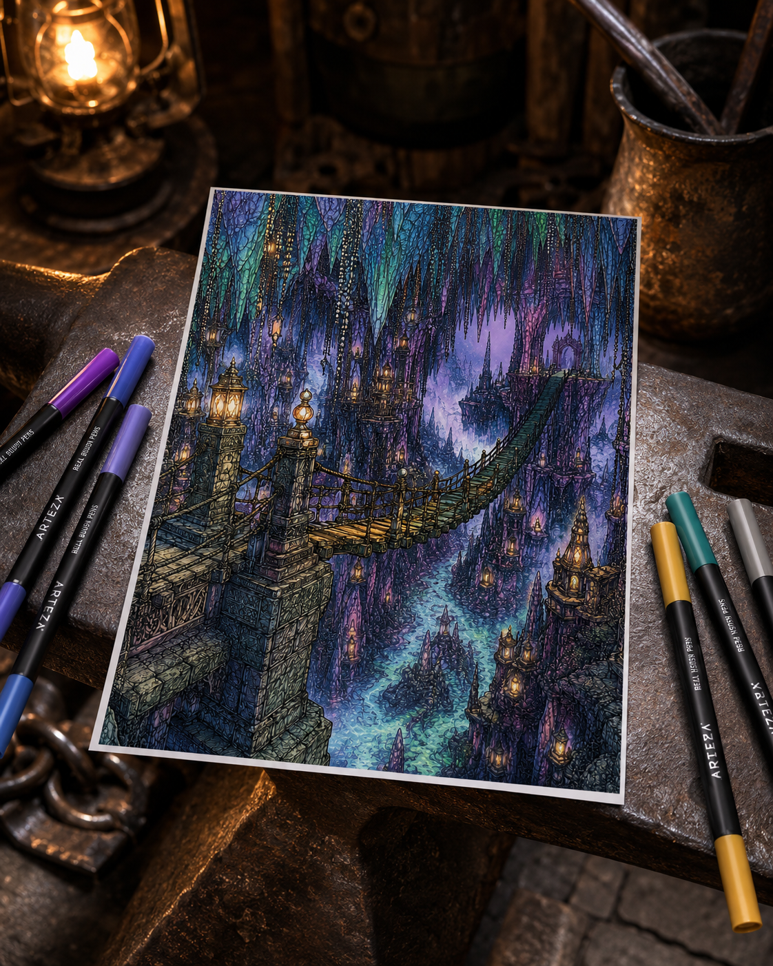
You’re coloring a gothic library, a moonlit forest, or a cozy evening cabin. You reach for deep burgundy, forest green, or velvet purple, hoping to create a scene that feels moody, dramatic, and full of atmosphere. Instead, something disappointing happens.
The burgundy turns into a dull brown. The forest green becomes a heavy, almost-black patch. The purple shadows slowly merge into lifeless grey… and the more layers you add in an attempt to fix the problem, the darker, flatter, and more overworked the page begins to look.
If this sounds familiar, take a breath. The problem usually isn’t your supplies—and it certainly doesn’t mean you’re bad at coloring. Muddy colors are often caused by a few simple things: combining incompatible undertones, using too much pressure too soon, adding more layers than the paper can hold, or accidentally covering every trace of light.
Learning how to make dark colors rich is not about making everything darker. It is about preserving color, contrast, and just enough light to let those deeper shades glow. Here’s how to build atmospheric dark colors that still feel dimensional and full of life, whether you prefer colored pencils, alcohol markers, or a combination of both.
1. Understand the Difference Between Dark and Muddy 🔍
A dark color isn’t automatically muddy. It becomes muddy when it loses its original color identity and visual structure.
| Rich dark colors | Muddy dark colors |
|---|---|
| Retain a recognizable hue | Become indistinct grey or brown |
| Contain visible lights, mid-tones, and shadows | Form one flat, dark value |
| Preserve important line art and texture | Obscure small details |
| Feel deep, luminous, and intentional | Look dull or overworked |
A rich burgundy still looks red. A deep forest green still carries a green or teal undertone. Midnight blue remains visibly blue, even in its darkest areas.
A muddy color, by contrast, no longer has a clear direction. You may not be able to tell whether it was originally meant to be brown, purple, blue, or green.
The simple rule: Rich darks still look like a color. Muddy darks look like an undefined mixture.
2. Don’t Start With Your Darkest Color 🖤
When you want to color a dark background, shadowy room, or heavy fabric fold, it can be tempting to begin with your darkest espresso, navy, or black. The problem is that starting too dark leaves very little room to create depth.
With colored pencils, heavy pressure can flatten the tooth of the paper before you have built your transitions. With alcohol markers, an intense first layer can make it difficult to preserve highlights or correct the color later. Instead, work through a simple light-to-dark sequence:
- Light base: Establish the main color with a pale or lightly applied layer.
- Mid-tone: Add the more saturated version of that color.
- Colored shadow: Deepen recessed areas with a compatible darker shade.
- Deep accent: Reserve your darkest value for the smallest crevices and contact shadows.
Example: Building a Rich Forest Green
- Begin with muted sage as the base.
- Add olive or forest green through the main body.
- Introduce deep teal or indigo in the shadowed areas.
- Use dark brown, charcoal, or black only in the deepest contact points.
Starting lightly allows some of the paper to remain visible beneath the pigment. That subtle brightness helps the finished color feel illuminated from within rather than heavy and pasted onto the page.
3. Use a Colored Shadow Instead of Black 🌌
Black can be useful, but it is rarely the only way to make a color darker.
When black is layered heavily over another color, it can quickly reduce its saturation and hide the undertone that made the original shade interesting. A colored shadow usually creates more depth while keeping the palette vibrant.
Try these combinations:
| Main color | Try using for shadows | Result |
|---|---|---|
| Crimson or deep red | Plum or deep violet | Velvety, romantic burgundy |
| Forest or moss green | Deep teal or indigo | Cool, atmospheric forest green |
| Burnt orange | Mahogany or dark red | Rich autumn terracotta |
| Navy blue | Violet or deep cyan | Luminous midnight blue |
| Chocolate brown | Burgundy or dark plum | Warm, antique dark wood |
| Plum or purple | Indigo or navy | Mysterious twilight violet |
Before reaching for black, look for the darkest blue, violet, teal, green, or brown in your collection. One of these may create exactly the depth you need without draining the color of its personality.
4. Keep Your Color Family Clear 🎨
Layering several colors does not automatically create more depth. Sometimes it simply makes the original hue harder to recognize. Imagine covering one area with warm olive, cool violet, reddish brown, grey, and finally black.
Those conflicting undertones begin to neutralize one another, gradually creating an unintended brownish or grey mixture.
For most objects, a palette of two to four compatible shades is enough:
- Base color: Establishes the main hue.
- Mid-tone: Adds saturation and form.
- Shadow color: Deepens the value while supporting the undertone.
- Deep accent: Creates contrast in a few carefully chosen places.
For example, a dark red curtain might use dusty rose, wine red, plum, and a touch of deep espresso. Every color contributes to the same overall direction.
More colors do not always create more depth. A small, harmonious palette is often more effective.
5. Preserve Small Areas of Light ✨
Dark colors only appear deep when they have something lighter to contrast against.
If an entire object is covered with the same heavy dark value, the eye can no longer understand its shape. A curtain loses its folds, a tree becomes a solid silhouette, and a dark wooden table may begin to look like a flat brown rectangle. Preserve a thin strip, soft patch, or small highlight on the side facing your light source:
- A dusty rose edge on a burgundy velvet curtain
- A muted sage rim along dark forest foliage
- A blue-violet reflection on moonlit roof tiles
- A narrow amber glow across dark wooden furniture
- A small teal reflection on the surface of dark water
You do not need a large white highlight. Even a slightly lighter version of the local color can give the viewer enough information to understand the object’s form.
Darkness feels deepest when a little light survives beside it.
6. Build Thin Layers With Colored Pencils ✏️
Colored pencils work best when the layers are built gradually. Beginning with heavy pressure can flatten the paper tooth and create a smooth, shiny surface that struggles to accept additional pigment.
Try this sequence:
- Apply the base lightly. Use gentle circular strokes or follow the natural direction of the object.
- Introduce the mid-tone. Increase the pressure slightly while leaving the highlight area visible.
- Add the shadow undertone. Place indigo, plum, teal, or another compatible dark shade inside folds and recessed areas.
- Return to the main color. Use it to soften the transition between the mid-tone and shadow.
- Add the deepest accent. Apply espresso, charcoal, or black only to the smallest and darkest crevices.
Be careful when using a strong white pencil over dark pigment. Depending on the pencil and paper, it may soften the color beautifully—or make it look cloudy and pastel. If you want to preserve a deep, saturated result, try blending with your mid-tone pencil or a colorless blender first. Test the combination on a separate piece of paper before using it on the finished page.
Having trouble covering larger sections evenly? Read How to Color Large Areas Without Streaks or Patchy Marks.
7. Layer Alcohol Markers Without Overworking the Paper 🖊️
Alcohol markers can produce wonderfully smooth, saturated dark colors, but printable paper can only absorb a limited amount of ink.
Repeatedly passing over an already saturated area may create blotches, feathering, damaged paper fibers, or unexpected dark edges.
For cleaner dark blends:
- Apply a light, even base coat.
- Add the mid-tone while the area is still slightly damp.
- Place the darkest shade only where the shadow is needed.
- Blend the transition once or twice rather than repeatedly scrubbing the paper.
- Allow the ink to dry before deciding whether the area needs another layer.
Alcohol ink often changes slightly as it dries. An area that looks uneven or extremely dark while wet may settle into a smoother, lighter result after a minute or two. Give the page time before trying to correct it.
If you’re new to markers, explore How to Use Alcohol Markers on Printable Coloring Pages for more preparation and paper-protection tips.
8. Use Warm and Cool Darks Intentionally 🔥❄️
Color temperature can create atmosphere before you add any complicated shading.
Warm darks
- Chocolate brown
- Burnt umber
- Deep rust
- Burgundy
- Warm charcoal
Warm darks feel intimate, aged, and inviting. They work beautifully for wood, books, fireplaces, autumn leaves, antique furniture, and candlelit interiors.
Cool darks
- Indigo
- Midnight blue
- Deep teal
- Aubergine
- Blue-grey
Cool darks suggest distance, mystery, night, and quiet. Use them for stone, fog, distant forests, moonlit gardens, night skies, and shadowed architecture.
Combining cool shadows with warm light is one of the easiest ways to create an atmospheric scene. A chestnut table shaded with a hint of indigo, for example, can look deeper and more dimensional than one shaded only with progressively darker browns.
9. Save Black for the Deepest Accents 🕯️
Black is extremely useful when it has a clear job.
Rather than using it as the main shadow color everywhere, reserve it for:
- Narrow contact shadows beneath objects
- Deep gaps between overlapping elements
- Unlit window interiors
- Small foreground silhouettes
- Keyholes, pupils, beaks, and tiny architectural details
- The darkest corners furthest from the light
If every shadow reaches pure black, the page loses its hierarchy. Nothing feels especially close, deep, or important because every dark area carries the same visual weight. When most of your shading is built with indigo, plum, burgundy, teal, or deep brown, a few final black accents can make the entire page feel more dramatic.
10. Stop Before the Color Becomes Overworked 🛑
Knowing when to stop is part of the coloring process.
With pencils, watch for a slick or polished surface caused by heavy pressure and repeated layering. If new strokes begin sliding across the page without leaving much pigment, the paper may already be fully burnished.
Wax bloom is slightly different: it can appear later as a pale, cloudy film on heavily layered wax-based pencils. If that happens, gently wipe the surface with a soft, clean cloth and avoid adding unnecessary heavy layers. With markers, stop if the paper looks extremely wet, begins to pill, or allows ink to spread beyond the outlines.
Other warning signs include:
- The base color is no longer recognizable.
- Light, mid-tone, and shadow have merged into one value.
- Each attempted correction makes the area darker.
- The printed line art is disappearing beneath the pigment.
When you feel stuck, step away for ten minutes. Look at the page from across the room or take a quick photo with your phone. A transition that seems imperfect from a few centimetres away may look completely natural within the full illustration.
11. Three Rich Dark Color Recipes 🌙
Keep these simple combinations nearby when you want atmospheric depth without endless color decisions.
Cozy Velvet Burgundy 🍷
Dusty Rose → Burgundy → Deep Violet → Dark Espresso
Use it for gothic curtains, cozy blankets, vintage dresses, old upholstery, and late-blooming roses.
Midnight Forest Green 🌲
Muted Sage → Forest Green → Deep Teal → Indigo
Ideal for nocturnal foliage, overgrown greenhouses, mossy stones, and woodland canopies.
Candlelit Dark Wood 🪵
Warm Ochre → Chestnut Brown → Burnt Umber → Plum or Deep Indigo
Try it on dark academia bookshelves, antique doors, desks, wooden beams, and candlelit interiors.
These formulas are starting points, not rigid rules. Swatch them first and adjust them to suit the pencils, markers, and paper you already own.
12. How to Rescue an Area That Already Looks Muddy 🛠️
A muddy section does not always need to be erased, covered, or abandoned.
Try these gentle rescue steps:
- Let it rest. Marker ink should dry completely before you assess the final color.
- Choose a dominant hue. Reinforce one recognizable color—such as burgundy, indigo, or forest green—instead of adding another unrelated shade.
- Re-establish the light direction. Strengthen the lighter edge with a pale version of the local color where the surface allows it.
- Deepen only the contact shadows. Avoid covering the entire area again. Concentrate your darkest pencil in narrow crevices and overlaps.
- Improve the surrounding contrast. Sometimes an area only looks muddy because everything beside it has a similar value.
- Add one strategic highlight. A tiny gel-pen or acrylic-marker reflection can restore a focal point on glass, metal, water, or another shiny surface.
You may not be able to make an overworked area lighter, particularly when using markers. But you can often make it look more intentional by restoring color direction, contrast, and a believable light source.
For more ways to strengthen a finished illustration, read Why Your Coloring Page Feels Flat (And 7 Simple Ways to Add Depth).
The Rich Dark Color Checklist ✅
Before finishing a dark section, ask yourself:
- Can I still recognize the main color?
- Did I preserve at least one lighter area?
- Have I tried a colored shadow before using black?
- Do my chosen shades have compatible undertones?
- Is my darkest value limited to the deepest shadows?
- Does the paper still accept additional pigment?
- Have I allowed marker ink to dry before adding more?
- Can I still distinguish the light, mid-tone, and shadow?
You do not need every answer to be perfect. The checklist is simply a way to pause before another unnecessary layer turns a rich color into a muddy one.
Darkness Still Needs Light 🌙
Dark, atmospheric colors do not have to feel heavy, flat, or lifeless.
By building gentle layers, choosing colored shadows, preserving small areas of light, and saving your deepest values for a few strategic places, you can create scenes that feel velvety, dimensional, and quietly luminous.
You do not need a flawless blend on your first attempt. Coloring is meant to be a restorative creative practice, not a test you have to pass. Keep your first layers light, let your colors breathe, and give yourself permission to stop before every transition feels perfect.
Happy coloring! 🌙🎨
Continue Building Depth and Atmosphere 🎨
Explore more practical guides for creating dimensional, atmospheric coloring pages:
- Why Your Coloring Page Feels Flat (And 7 Simple Ways to Add Depth)
- How to Color Large Areas Without Streaks or Patchy Marks
- How to Use Alcohol Markers on Printable Coloring Pages
- How to Color Warm Light & Cozy Glow
- How to Choose a Coloring Palette When You Have No Idea Where to Start
Ready for a Quiet Coloring Break? 🌿
Download three free printable coloring pages and use them to experiment with colored shadows, gentle layering, and richer dark palettes—without worrying about getting everything perfect.
👉 Download 3 Free Coloring Pages
Choose a few shades, put your phone aside, and enjoy a little quiet time with color.
Leave a Reply