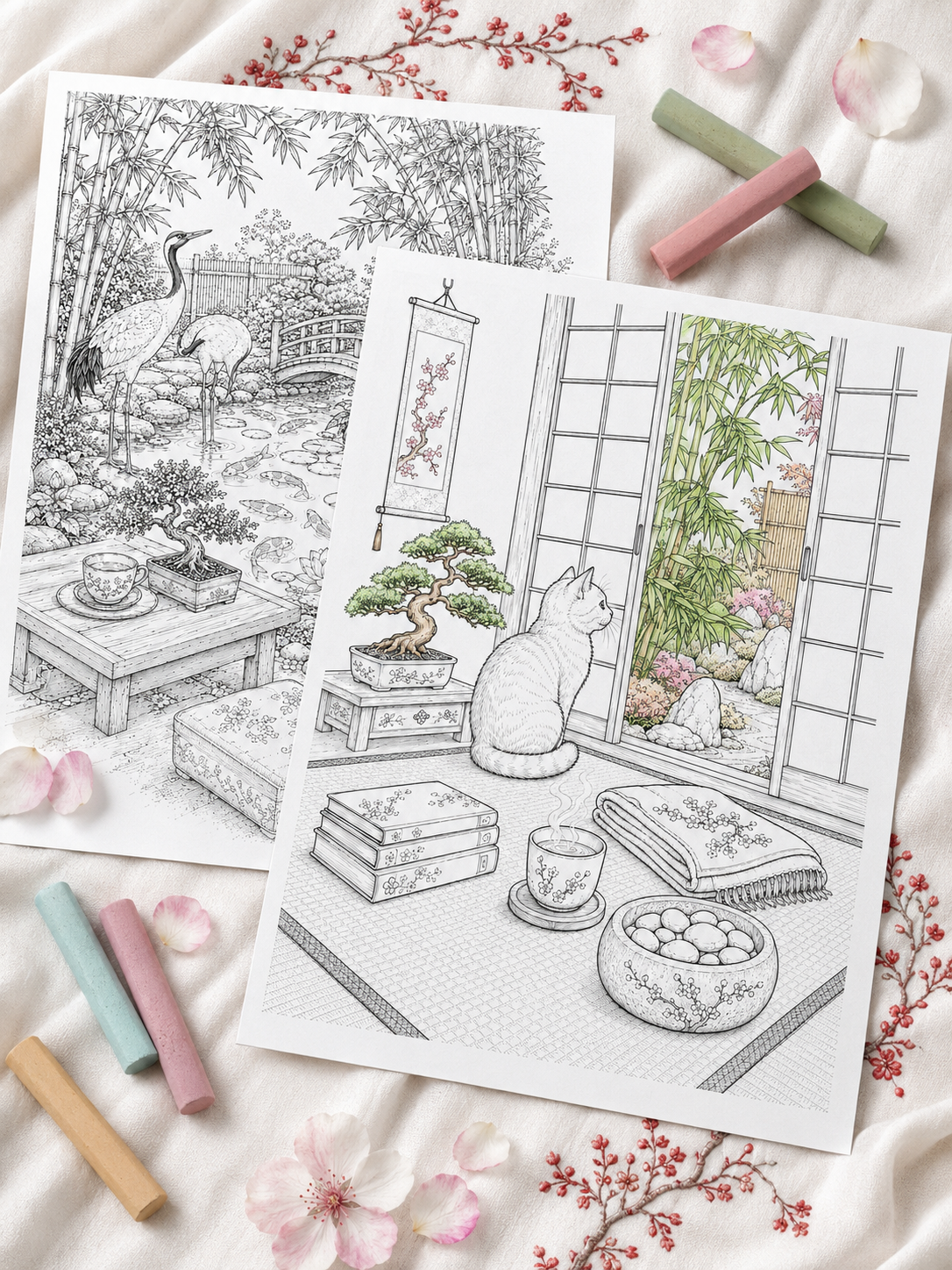
The tiny flowers look beautiful. The character’s face is carefully shaded. Even the smallest decorative details are finished. Then you reach the sky, the wall or that enormous section of fabric—and suddenly every pencil stroke, marker overlap and patchy gap seems impossible to hide.
Large open spaces can be surprisingly intimidating. When you work on tiny details, the surrounding linework helps conceal minor imperfections. In an uninterrupted area, however, every variation becomes more noticeable:
- visible pencil strokes;
- darker bands caused by overlapping marker ink;
- tiny white spots between pencil layers;
- uneven saturation from changing hand pressure;
- paper fibres damaged by too many passes;
- a test swatch that looked smooth but behaved differently on the actual page.
The good news is that smooth coverage depends far less on owning expensive professional supplies than it does on matching your technique to the material, paper and size of the area. Whether you use colored pencils, alcohol markers, water-based pens or gel pens, this guide will help you create more consistent coverage—and rescue a page when the result does not go as planned.
In this guide, you’ll learn how to color large areas more evenly with colored pencils, alcohol markers and water-based pens—without overworking the paper. If choosing what to place behind your subject is the problem, rather than how to apply the color, begin with How to Color Backgrounds Without Ruining Your Coloring Page.
1. Why Large Areas Show Every Little Mark 🔍
A small object naturally breaks the color into manageable sections. A large wall, blanket or open sky gives the eye one continuous surface to examine.
Several things can make imperfections more visible.
There Are Fewer Visual Breaks
Details, patterns and outlines distract the eye from small variations. Open areas provide nowhere for an uneven stroke to hide.
Liquid Ink Dries Quickly
With markers, one section may begin drying before you reach the next. When fresh ink overlaps a partially dry edge, it can create a darker band.
Your Hand Pressure Changes
As your hand moves across a large area, your grip may become firmer or lighter without you noticing. With colored pencils, even a small change in pressure can affect the value and texture.
Paper Has Its Own Texture
Colored pencils move across the raised surface of the paper while leaving tiny recessed areas unfilled. On textured paper, these white flecks are a normal part of the medium until more layers are added.
We Often Rush Large Spaces
A wide, empty shape can feel repetitive, encouraging us to press harder or move faster simply to finish it.
Key principle: A large area magnifies your technique—but it also gives you room to build color gradually.
2. Check Your Paper Before Blaming Your Technique 📄
Sometimes uneven coverage is not entirely caused by your hand. Different papers react very differently to pencils and markers.
| Paper type | Works well with | Possible challenge |
|---|---|---|
| Smooth, low-tooth paper | Alcohol markers and fine details | Holds fewer heavy pencil layers |
| Medium-tooth paper | Layered colored pencils | Shows more white paper texture |
| Highly absorbent paper | Quick, simple applications | Marker ink dries and spreads rapidly |
| Heavy cardstock | Pencils and some mixed media | May use more marker ink and challenge some printers |
Smooth Paper
Smooth paper allows marker nibs to move freely and reduces some visible texture. Colored pencils can also look clean on it, although there may be less tooth available for many layers.
Textured Paper
A moderate texture helps grab colored-pencil pigment and makes gradual layering possible. The trade-off is that small white flecks may remain visible until several light layers have been applied.
Highly Absorbent Paper
Some printable and mass-market coloring papers absorb ink very quickly. This can make it difficult to maintain a wet edge with alcohol markers and may increase bleeding or dark overlaps.
Heavy Cardstock
Cardstock generally tolerates pressure and layering well, but it is not automatically marker-friendly. Its coating and absorbency still matter, so testing remains essential.
The Four-Step Paper Test
Whenever you print on unfamiliar paper:
- Apply one light stroke.
- Cross it with a second stroke.
- Try a small two-color transition.
- Test light, medium and firm pressure.
Use a margin or a separate sheet from the same paper pack. Testing on ordinary copy paper will not tell you how your chosen page will behave.
3. Choose the Right Tool for the Area 🖍️
Using a tiny nib on a large sky creates far more overlaps than necessary. Whenever possible, match the width and behaviour of the tool to the space you need to cover.
| Area | Suggested tool | Likely effect |
|---|---|---|
| Soft sky or cloudscape | Soft colored or pastel pencils | Gradual and atmospheric |
| Flat wall or architecture | Alcohol marker with a broad nib | Saturated, controlled coverage |
| Sweater, blanket or fabric | Colored pencils | Texture and dimensional folds |
| Graphic background | Water-based or paint marker | Bold, intentionally graphic color |
| Stars and metallic details | Gel or fine paint pen | Crisp highlights |
| Fog or distant horizon | Pale colored pencils | Soft, diffused layers |
No material guarantees a perfectly uniform finish. The aim is to choose the tool that gives you the greatest control with the fewest unnecessary passes.
4. The Three Rules of Smooth Coverage ✨
Keep these three principles in mind whenever you approach a large shape:
Light pressure – Consistent movement – Controlled overlap
Work Lightly
Do not force the final saturation into the first layer. A pale base gives you room to correct pressure, adjust the value and add depth.
Keep Your Movement Consistent
Try to maintain a similar stroke direction, speed and pressure across each individual layer.
Overlap With Intention
Each stroke should meet the previous one gently. With markers, overlap while the working edge is still damp. With pencils, use light overlapping movements to prevent hard gaps and ridges.
5. How to Color Large Areas With Colored Pencils ✏️
Colored pencils take time, but they offer excellent control over large areas, soft backgrounds and textured fabrics.
Start With a Light Base Layer
Hold the pencil slightly farther from the tip to reduce pressure naturally. Apply a pale layer across the entire area before trying to darken any individual section.
The first layer will probably look lighter and grainier than the final result. That is normal.
Use Small Overlapping Movements
Small circles or oval movements help distribute pigment without leaving obvious stopping points. Long parallel strokes can also work, particularly for skies or fabric, provided your pressure remains light and consistent.
Avoid pressing heavily whenever the pencil changes direction. Those small pressure points often become the darkest marks in the area.
Change Direction Between Layers
Approach the paper texture from more than one direction:
- apply the first layer diagonally;
- add the second in the opposite direction;
- finish with circular or horizontal movements.
This gradually fills the tooth without forcing pigment into the paper all at once.
Build Color Gradually
A simple progression might be:
- light base color;
- second layer to even the coverage;
- deeper color in shadow areas;
- final soft layer to connect the values.
Blend Only After Building Enough Color
A colorless blender or pale colored pencil works best when pigment is already present. Blending too early may flatten the paper tooth before you have built sufficient depth. The number of layers needed will depend on the paper and pencil. Treat three or four layers as a starting point, not an inflexible rule.
Know When to Stop
Repeatedly correcting a nearly finished surface can make it waxy, shiny or uneven. Step back from the page before adding another layer.
6. How to Avoid Streaks With Alcohol Markers 🖋️
Alcohol markers can create rich coverage, but large areas require a steady workflow because the ink dries quickly.
Use the Broadest Suitable Nib
A brush or chisel nib covers more paper in each pass than a fine bullet nib. Fewer passes mean fewer opportunities for dark overlaps.
Keep a Wet Working Edge
Move across the shape in steady, slightly overlapping strokes. Add the next pass while the edge of the previous one is still damp. For a very large area, plan a route before starting so you do not become trapped between sections that have dried at different times.
Work in Manageable Sections
Use existing elements as natural boundaries:
- clouds;
- furniture;
- tree branches;
- folds of fabric;
- architectural lines;
- areas of shadow.
These breaks allow you to pause without creating an obvious seam in the middle of an open surface.
Don’t Outline the Entire Shape First
If you trace the full perimeter and then fill the centre, the outline may dry before the rest of the ink reaches it, creating a noticeably darker border.
Instead, complete the border and interior together as you move across the area.
Accept Some Natural Variation
Paper, nib condition and ink flow all influence the finish. Even careful marker work can show subtle tonal differences, especially on absorbent paper. A handmade page does not need the perfectly flat finish of digitally printed color.
7. How to Use Water-Based Markers Without Damaging the Paper 💧
Water-based ink behaves differently from alcohol ink. Repeated passes can soften the paper fibres, causing pilling or tearing.
For safer coverage:
- use light, swift strokes;
- maintain a consistent direction;
- limit repeated passes over damp paper;
- allow the area to dry before evaluating it;
- avoid scrubbing one pale spot;
- embrace a slightly graphic texture.
If a large solid fill feels too risky, use the marker to create:
- a soft vignette;
- repeated dots;
- controlled parallel lines;
- a simple pattern;
- a colored halo around the subject.
An intentional pattern usually looks better than an overworked attempt at perfectly flat color.
8. What About Gel Pens? ✨
Gel pens are excellent for opaque accents but rarely ideal for very large surfaces.
They:
- use ink quickly;
- dry slowly;
- may smear beneath your hand;
- leave visible rolling tracks;
- make smooth transitions difficult.
Reserve them for stars, metallic accents, magical details, tiny patterns and reflective highlights.
If you want to use a gel pen over a moderately sized area, consider parallel hatching, dots or another clearly intentional texture rather than trying to imitate a marker fill.
9. Five Common Mistakes That Cause Patchy Color ⚠️
1. Pressing Too Hard Too Soon
Heavy pressure on the first pencil layer flattens the paper texture and leaves little room for correction.
2. Using a Tiny Nib on a Huge Area
The more strokes you need, the more visible overlaps you are likely to create.
3. Changing Direction Randomly
Changing direction between complete pencil layers can help. Changing it constantly within the same layer tends to create a confused surface.
4. Repeatedly Fixing One Small Spot
A pale patch can quickly become the darkest mark on the page when corrected in isolation. It is usually safer to connect the adjustment with the surrounding area.
5. Expecting Every Material to Look the Same
Colored pencils naturally retain some paper texture. Water-based pens can show deliberate strokes. Alcohol markers create a different kind of saturation.
The goal is not to make every material imitate printed ink.
10. How to Fix Streaks and Patchy Areas 🛠️
Before correcting anything, stop and allow the surface to settle or dry. Some marks appear more dramatic while you are working than they do a few minutes later.
| Problem | Possible correction |
|---|---|
| Grainy pencil coverage | Add another light layer in a different direction |
| One area is too dark | Extend it gradually into a shadow or gradient |
| Alcohol marker overlaps | Test whether a controlled full second layer improves the area |
| Damaged water-based paper | Let it dry completely before making further changes |
| Persistent irregularity | Incorporate an appropriate environmental texture |
If Pencil Coverage Looks Grainy
Apply another light layer using small circular movements or a different stroke direction. A pale related color can help connect the texture without making the area dramatically darker.
If you choose to burnish, do so gently and only after building enough pigment.
If One Area Is Too Dark
Instead of trying to remove it completely, expand the darker value gradually. It may become:
- a cast shadow;
- the beginning of a vignette;
- a fold in fabric;
- a darker edge of the sky;
- a natural variation in the surface.
If Alcohol Marker Overlaps Are Visible
On suitable paper, a controlled second layer over the entire section may soften some boundaries by re-wetting the ink. Test this first: depending on the paper and color, another layer may also increase saturation or create additional variation.
A gentle gradient is sometimes safer than continuing to chase perfectly flat coverage.
If Water-Based Ink Has Damaged the Paper
Stop adding moisture and let the page dry fully. If the fibres remain intact, a soft colored pencil may help integrate the surrounding color.
If the surface has started to pill, keep further work minimal.
Turn the Mark Into Part of the Scene
Persistent variation can become:
- cloud wisps;
- falling rain;
- wood grain;
- woven fabric;
- aged plaster;
- leaf shadows;
- distant mist.
Use this approach only when the added texture makes sense within the illustration.
For additional help with contrast and value, read Why Your Coloring Page Feels Flat (And 7 Simple Ways to Add Depth).
11. Turn Imperfection Into Texture 🌿
In cozy, atmospheric artwork, perfectly flat color is not always the most interesting choice.
Natural environments contain variation:
- a softly uneven blue can resemble a misty sky;
- irregular brown can suggest weathered timber;
- visible pencil texture can make a blanket feel woven;
- tonal changes can give stone and plaster age;
- gentle streaks can become rain or reflected light.
Smooth does not have to mean sterile, and handmade does not have to mean flawed.
The goal is not to remove every visible trace of the coloring process. It is to make those traces feel consistent with the material you are trying to represent.
12. A Simple Method for Any Large Area 🧭
Whenever you face a large open shape, follow this process:
- Test: Try the tool on the same or similar paper.
- Select: Choose an appropriate pencil softness or the widest practical nib.
- Plan: Decide your stroke direction and working route.
- Begin lightly: Apply a pale, forgiving base.
- Stay consistent: Maintain similar pressure, speed and movement.
- Overlap gradually: Connect each pass with the one before it.
- Pause: Let the surface settle before correcting local marks.
- Evaluate: View the page from a normal distance.
13. The Large-Area Rescue Checklist ✅
Before attempting another correction, ask yourself:
- Is the paper already saturated with ink or wax?
- Does the whole area need another layer, or am I focusing on one tiny mark?
- Could the darker section become a natural shadow?
- Would mist, grain or fabric texture suit the scene?
- Am I expecting pencils to behave like markers?
- Will another pass improve the area—or simply make it darker?
- Is the mark still distracting when I view the entire page?
Your Page Doesn’t Need Factory-Perfect Coverage 🌙
When you sit close to your desk, every pencil line, marker overlap and fleck of white paper can feel enormous.
But a finished coloring page is meant to be viewed as a complete image—not inspected from a few centimetres away.
A little surface variation gives hand-colored artwork warmth and character. Focus on light pressure, consistent movement and gradual layering. Learn how your paper responds, pause before overcorrecting and allow each material to retain some of its natural texture.
You are creating a quiet, human piece of art—not a factory-printed surface.
Ready to Practise Smoother Coloring? 🎨
Download 3 free printable coloring pages and use them to practise light pencil layers, controlled marker overlaps and soft atmospheric gradients—without experimenting inside a nearly finished coloring book.
👉 Download 3 Free Coloring Pages
Want to Master Light, Texture and Atmosphere? 🌿
If you would like to explore seamless lighting, natural wood and stone textures, atmospheric gradients and dimensional contrast, continue with The Art of Atmospheric Coloring.
This practical guide walks you through creating richer, more immersive coloring pages with pencils and markers—one approachable technique at a time.
Leave a Reply