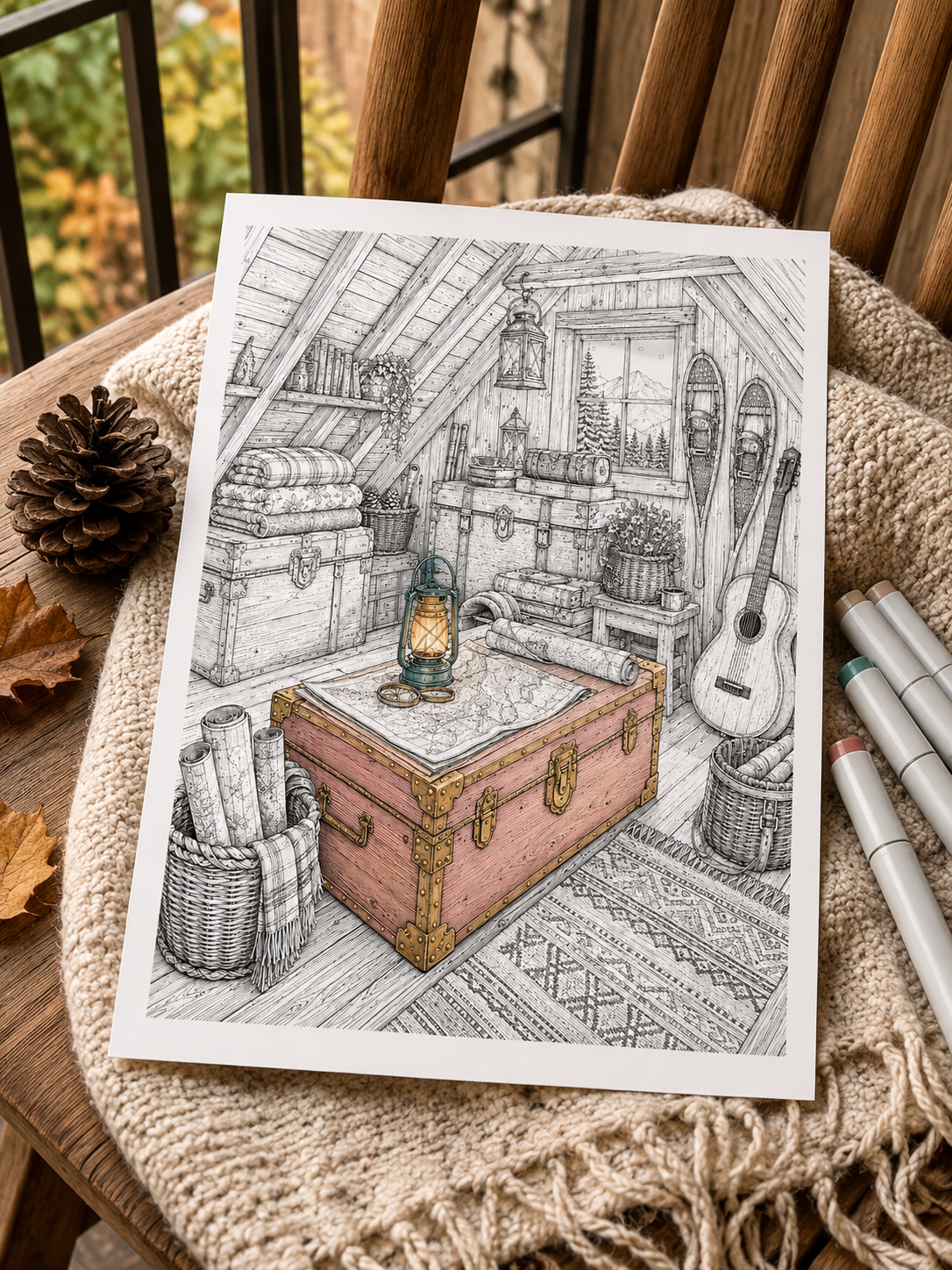
You print a beautiful coloring page, select your favourite alcohol markers and begin filling the first section. The colors look wonderfully rich—until the ink spreads beyond the line, soaks through the paper or leaves a darker patch where two strokes overlap.
Alcohol markers are deeply satisfying to use, but home-printed coloring pages can introduce a few unexpected questions:
- Which paper should you choose?
- Can your home printer handle thicker paper?
- How do you stop the ink from reaching your desk?
- Is it possible to blend without smudging the printed linework?
- How can you prevent streaks and bleeding around small details?
- What can you do when a color escapes beyond the outline?
With the right paper, appropriate printer settings and a few simple habits, alcohol markers can become one of the most enjoyable tools for printable coloring pages.
In this guide, you’ll learn how to use alcohol markers on printable coloring pages, from choosing and testing your paper to creating smooth fills, simple blends and richer mixed-media effects.
1. Why Alcohol Markers Work So Well for Printable Pages ✨
Alcohol markers contain dye carried by an alcohol-based solvent. The solvent evaporates relatively quickly, leaving vibrant color behind.
This makes the markers particularly useful for printable pages because they offer:
- rich, saturated color;
- faster coverage than colored pencils;
- the possibility of blending related shades;
- several nib sizes for different spaces;
- smooth base layers for later pencil details;
- the freedom to reprint a digital page and try another palette.
Cozy Easy and Balanced illustrations are especially marker-friendly because their larger, closed shapes provide room for broad nibs and uncomplicated color combinations.
There is one important thing to understand before you begin:
Alcohol markers are designed to saturate paper. Bleed-through is normal and does not necessarily mean that you are using them incorrectly.
The goal is not always to prevent ink from reaching the back of the page. It is to control how far the ink spreads sideways and protect the surface underneath.
2. Start With the Right Paper 📄
Paper affects ink flow, blending time, bleed-through and the amount of ink required to fill a shape.
There is no universally perfect paper. The best option depends on your printer, markers and preferred finish.
| Paper | Best for | Possible limitation |
|---|---|---|
| Standard printer paper | Swatches and casual tests | Absorbs ink quickly |
| Smooth cardstock | Finished printable pages | May be too heavy for some printers |
| Marker paper | Blending and controlled ink use | Can be thin or difficult to print |
| Smooth Bristol paper | Polished mixed-media results | More expensive and often heavier |
Standard Printer Paper
Ordinary copy paper is inexpensive, easy to print and useful for testing palettes. However, it may absorb alcohol ink rapidly, which can:
- increase bleed-through;
- make blending more difficult;
- encourage ink to spread beyond the line;
- use more marker ink.
It can still be used successfully, particularly for simple flat fills, but test it before committing to a detailed page.
Smooth Cardstock
Smooth cardstock offers a sturdier surface and works well for pages you want to frame or keep in a binder.
Check your printer manual before purchasing a large pack. Maximum supported paper weight varies considerably between printer models, and a manual or rear feed may handle thicker sheets better than a curved paper tray.
Marker Paper
Marker paper is designed to manage alcohol ink, but products vary. Some sheets slow absorption or include a barrier; others still allow significant bleed-through while supporting smoother gradations.
Marker paper can also be thin or translucent. Make sure it is intended for printing and compatible with your particular printer.
Smooth Bristol Paper
Smooth Bristol can produce polished results and accommodate a combination of marker bases and pencil shading. Its thickness, however, may require a manual feed and may exceed the specifications of some domestic printers.
Always Test the Actual Paper
On a spare piece from the same pack:
- Apply one marker stroke.
- Add a second overlapping stroke.
- Test a two-color blend.
- Check the back of the paper.
- Watch how far the ink expands toward a printed line.
A test on ordinary copy paper will not predict how your chosen cardstock or marker paper will behave.
3. Check What Your Printer Can Handle 🖨️
Before printing an entire collection, consult your printer manual or specifications.
Check:
- maximum supported paper weight;
- compatible paper types;
- manual or rear-feed options;
- A4 or US Letter settings;
- portrait orientation;
- printable margins;
- recommended media setting.
Print one test page before committing to the whole bundle.
Actual Size or Fit?
Use Actual Size when the PDF already matches your paper and all artwork falls within your printer’s margins.
Use Fit or Fit to Printable Area when the preview shows part of the border being cropped.
Always inspect the print preview before continuing.
Print Quality
Begin with a standard black, grayscale or normal-quality setting. Draft mode may make fine lines too pale, while very dense or photo-oriented settings may deposit more ink than necessary.
The ideal setting depends on the printer and paper, so test the printed linework before coloring.
4. Will Printer Ink Smear With Alcohol Markers? 🖤
Compatibility depends on the printer, ink or toner, paper and marker.
Laser Printers
Laser printers use heat to fuse toner onto the paper. This often produces stable linework for marker coloring, but it is still sensible to test the combination—particularly on coated or specialised paper.
Inkjet Printers
Inkjet printers deposit liquid ink, and some formulations may react when alcohol marker ink passes over them.
To test your print:
- Allow the page to dry fully.
- Choose a pale marker.
- Pass it over an unimportant line near the edge.
- Check whether the black line smears.
- Inspect the marker nib for transferred ink.
If black ink transfers, avoid repeatedly dragging the marker directly across the printed lines. Work toward the border with a lighter touch and allow the marker ink to expand naturally. Do not assume that a fixed drying time works for every printer. Different inks, papers and environmental conditions dry at different rates.
5. Protect Your Desk—and Give Yourself Fresh Air 🛡️
Place a non-porous protective layer directly beneath the printed page.
Good options include:
- a silicone craft mat;
- a smooth plastic sheet;
- a laminated board;
- a marker-safe protective mat.
A single piece of ordinary paper may absorb some ink, but it may not prevent the color from reaching the table.
If you use a reusable plastic barrier, wipe it clean after the page dries. Wet residue could transfer onto the next sheet. When coloring inside a book, insert the barrier immediately behind the active page. Alcohol markers are generally unsuitable for double-sided designs because the reverse image is likely to be affected.
Alcohol markers should also be used in a comfortably ventilated space. Close each cap promptly, keep the markers away from flames and high heat, and follow the safety guidance supplied by the manufacturer.
6. Build a Small Marker Palette First 🎨
Marker caps and digital color charts do not always show how the ink will appear on your paper.
Create swatches on a piece of the same paper used for the illustration.
A simple palette might include:
- Light base: the palest value
- Mid-tone: the main shading color
- Deep shadow: used sparingly
- Neutral: for wood, stone or secondary elements
- Accent: reserved for focal details
A limited palette reduces decision fatigue and makes the finished page feel more cohesive.
Need help selecting colors? Continue with How to Choose a Coloring Palette When You Have No Idea Where to Start.
7. Work From Light to Dark 🌤️
For beginners, light-to-dark layering offers the most control.
- Apply the lightest color.
- Introduce the mid-tone in shadow areas.
- Add small amounts of the darkest shade.
- Use the light or mid-tone marker to soften the transition if the paper allows it.
Remember that the light marker does not erase the dark one. It may re-wet and move the ink, but it can also deepen the overall saturation.
Preserve some highlights from the beginning instead of trying to recover them later.
Useful shadow areas include:
- beneath overlapping petals;
- under shelves and roof edges;
- inside folds;
- behind furniture;
- where objects touch;
- on the side facing away from the light.
8. How to Get Smoother, More Even Fills 🖌️
Streaks often appear when one marker pass dries before the adjacent pass reaches it.
Use the Right Nib
- Bullet nib: small details and narrow shapes
- Brush nib: curved areas, flick strokes and transitions
- Chisel nib: walls, skies, floors and other broad spaces
Keep a Damp Working Edge
Move steadily across the area, overlapping each pass slightly with the previous one.
Do not rush, but avoid long pauses in the middle of an uninterrupted shape.
Use Natural Subsections
Break a large area at existing visual boundaries:
- beams;
- fence posts;
- fabric folds;
- branches;
- clouds;
- cast shadows.
These boundaries give you places to stop without leaving a conspicuous seam.
Don’t Outline the Entire Shape First
If you trace the perimeter and then fill the centre, the border may dry before the rest of the ink reaches it, creating a darker frame.
Complete the edge and interior together as you move through the area.
For a more detailed explanation, read How to Color Large Areas Without Streaks or Patchy Marks.
9. Three Approachable Blending Methods 🌈
Method 1: Light-to-Dark Layering
Apply a light base, introduce the mid-tone and add the dark value only where necessary.
This is the safest technique for beginners because you can stop after any stage.
Method 2: Feathering
Using a brush nib, make light flicking strokes that lift away from the paper at the end.
Flick the darker color outward from the shadow, then use the lighter color from the opposite direction. The tapered ends can create a more gradual transition.
Feathering works particularly well for:
- leaves;
- petals;
- hair;
- fur;
- folds in fabric.
Method 3: Tip-to-Tip Blending
A small amount of darker ink can be transferred temporarily to the tip of a lighter alcohol marker, producing a stroke that gradually returns to the marker’s original color.
Because recommendations vary by brand, check the manufacturer’s instructions first. Use compatible alcohol markers, keep the contact brief and clean the light nib on scrap paper afterward.
A safer alternative is to scribble the dark color onto a non-porous palette and pick up a small amount with the lighter nib.
10. How to Stay Inside Detailed Line Art 🎯
Alcohol ink spreads through paper fibres beyond the exact point touched by the nib.
To maintain cleaner edges:
- stop a small distance inside the outline;
- allow the ink to expand naturally;
- use less pressure near borders;
- switch to a smaller nib in tight corners;
- rotate the page to keep your wrist comfortable;
- avoid repeatedly saturating narrow sections.
Start with the smallest or most awkward areas, then fill the easier central space.
On highly detailed illustrations, consider a hybrid approach: use markers for broad base colors and colored pencils for small shapes, controlled edges and texture.
11. Match the Technique to the Detail Level 🔎
Cozy Easy
Ideal for:
- simple marker palettes;
- broad brush or chisel fills;
- quick creative sessions;
- minimal shading.
Balanced
Suitable for:
- two- or three-color blends;
- simple shadows;
- brush and bullet nib combinations;
- marker bases with pencil details.
Immersive
Best approached with:
- carefully tested paper;
- fine nibs;
- small working sections;
- organised swatches;
- a hybrid marker-and-pencil technique.
If you are unsure which page suits your energy today, read Which Coloring Style Fits Your Mood Today?
12. Common Alcohol Marker Problems—and How to Fix Them 🛠️
| Problem | Likely cause | What to try |
|---|---|---|
| Ink spreads beyond the line | Too much saturation near the edge | Let it dry and integrate the mark into a shadow or darker detail |
| Fill looks streaky | Ink dried between passes | Test a controlled full second layer |
| Blend looks muddy | Too many layers or distant colors | Let it dry and simplify the transition |
| Paper looks soaked | Excessive wet layering | Stop and allow the solvent to evaporate |
| Nib picks up black ink | Printed linework is reacting | Clean the nib on scrap paper and change your application method |
If Ink Escapes the Outline
Do not immediately add more wet color.
Once dry, you may be able to:
- incorporate the mark into a cast shadow;
- deepen the neighbouring outline with pencil;
- add a small environmental detail;
- cover a tiny area with an opaque paint marker.
A white gel pen may help with very small marks, but alcohol dye can sometimes show through thin corrections.
If the Fill Looks Streaky
A full, controlled second layer may soften the variation on suitable paper. Test it first: another layer can also make the area darker or wetter.
If the Blend Looks Muddy
Stop adding ink and allow the page to dry. Once dry, decide whether the transition genuinely needs correction. Often the blend looks softer when viewed as part of the entire page.
If the Paper Becomes Saturated
Move to another part of the illustration and let the surface dry. Continuing to add wet layers may increase spreading and damage the paper.
If the Marker Picks Up Printer Ink
Scribble gently on clean scrap paper until the original marker color returns. For future pages, avoid passing repeatedly over the printed line and reconsider the paper or printer settings.
13. Combine Markers and Colored Pencils ✏️
Alcohol markers and colored pencils work beautifully together when used in the right order:
- Apply the alcohol marker base.
- Let the page dry completely.
- Add shadows and textures with colored pencils.
- Finish with a few deliberate highlights.
Colored pencils can introduce:
- wood grain;
- fur;
- fabric texture;
- stone variation;
- sharper shadows;
- fine botanical details.
Apply markers before heavy pencil layers. Wax and pigment on the paper can transfer to the marker nib, affecting its ink flow.
To explore this approach in more depth, continue with The Art of Atmospheric Coloring.
14. Take Care of Your Markers 🧰
A few habits can extend their useful life:
- close the caps immediately after use;
- make sure both ends of a dual-tip marker are sealed;
- store them according to the manufacturer’s instructions;
- keep them away from direct sunlight, flames and high heat;
- clean transferred color by scribbling gently on scrap paper;
- use the side of the brush nib for broad strokes;
- avoid crushing the tip with excessive pressure.
Many dual-tip alcohol markers are stored horizontally to help keep ink distributed between both nibs, but always follow the guidance for your particular brand.
15. A Beginner-Friendly Workflow ✅
For your next printable page:
- Check the printer’s paper specifications.
- Print one test page.
- Let the linework dry.
- Test a pale marker over a secondary line.
- Swatch the palette on matching paper.
- Place a non-porous barrier underneath.
- Work from light to dark.
- Complete one manageable section at a time.
- Allow the page to dry before making corrections.
- Add pencil texture and highlights last.
Let the Markers Do What They Do Best 🌙
Alcohol markers do not need to behave like pencils or watercolors.
They are at their best when used for rich color, confident shapes, smooth base layers and controlled transitions.
Do not expect every surface to look mechanically flat. Paper, nib condition and ink flow all introduce small variations—and those variations do not make your page unsuccessful.
Test your materials, protect your desk, keep the room comfortably ventilated and begin with a simple palette. Most importantly, enjoy watching the black-and-white illustration come to life.
Ready to Test Your Markers? 🎨
Download 3 free printable coloring pages and use them to test your paper, build a limited marker palette and practise controlled coverage at home.
👉 Download 3 Free Coloring Pages
Want to Go Beyond Flat Color? 🌿
Learn how to transform simple marker bases into richer artwork filled with glowing light, natural texture and atmospheric depth with The Art of Atmospheric Coloring.
Leave a Reply