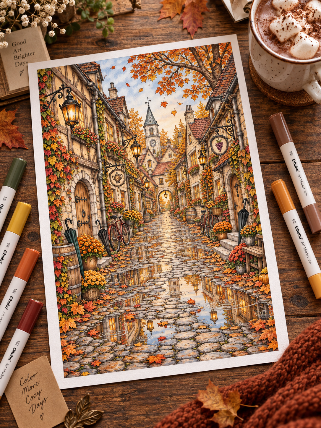
You have spent hours carefully adding color to a page you love. You chose a palette that felt right, stayed inside the lines, and filled every corner with care. But when you finally step back to look at the result, something feels slightly off.
The illustration does not look bad. It just looks… flat. When a coloring page feels flat, the problem is rarely a lack of skill—it usually comes down to value, contrast, light direction and visual focus.
The cozy cabin seems to disappear into the trees behind it. The character in the armchair feels pasted onto the room instead of sitting inside it. Every flower, brick, leaf and window is visible, yet your eye does not know where to land first.
If this sounds familiar, take a breath: it does not mean that you chose the wrong colors or ruined the page. In most cases, the problem is not the palette itself. It is the relationship between light and dark, foreground and background, focal point and supporting detail.
You do not need years of fine-art training or expensive professional supplies to improve it. Creating depth is simply about helping the viewer’s eye understand what is close, what is far away, what catches the light and what matters most.
The seven techniques below are designed to be approachable, low-pressure and easy to test on a page you have already started.
Quick reminder: You do not need to use all seven techniques at once. Choose the one that best describes what feels missing from your page and begin there.
1. Check Your Value Range: Your Colors May Be Too Similar 🔍
Two colors can look completely different in your pencil case—a dusty sage and a soft lavender, for example—yet share almost the same level of brightness. This lightness or darkness is called value.
When a main subject and its background have similar values, their edges begin to disappear into one another. The colors may be beautiful individually, but the scene still lacks separation.
Try the Five-Second Black-and-White Test
Take a quick photo of your coloring page and temporarily apply a black-and-white filter.
Look at the result and ask:
- Can I still identify the main subject immediately?
- Do the foreground and background remain separate?
- Is there at least one area that feels noticeably lighter or darker?
If the cabin, trees and path merge into one similar grey, you probably need a wider value range.
You do not have to replace your palette. Try deepening selected shadows with a darker version of a color you already used, while protecting the lightest areas. A deeper pine green behind a pale cabin, for example, may be enough to bring the building forward.
Avoid outlining every object with the same dark pencil. That can create separation, but it often makes the page look heavier rather than more dimensional. Place your darkest values where they support the scene: behind the focal subject, beneath overlapping objects and inside the deepest crevices.
2. Choose One Clear Focal Point 🎯
If every element is colored with the same intensity, contrast and amount of detail, everything asks for attention at once. When every leaf and brick is treated like the star of the page, the viewer has no clear place to begin.
Choose one hero element that should attract the eye first. It might be:
- a glowing cabin window;
- a woodland character reading in an armchair;
- a lantern along a forest path;
- a flower at the center of a bouquet;
- a welcoming front door;
- a reflection on wet cobblestones.
Concentrate your strongest contrast, brightest highlight or richest color around that area. Then allow the surrounding details to become quieter.
Quiet does not mean unfinished. Background elements can still be beautifully colored; they simply do not need the same saturation, sharpness or contrast as the focal point.
If you are unsure which element to choose, slightly blur your eyes while looking at the page. The broad shapes will become more obvious, making it easier to decide where the visual story should begin.
3. Choose One Simple Light Direction 💡
A common source of flatness is shading each object separately without deciding where the scene’s light comes from. A mug receives a dark border, then a chair receives another dark border, then a tree trunk is shaded on both sides. Each object has shading, but the page does not share one lighting story.
You do not need a complex perspective lesson to improve this. Try the Corner Light Rule:
Imagine a small sun, window or lamp positioned near one upper corner of the page. Shade the sides of your main objects that face away from that light.
If the light comes from the upper left, the right and lower planes of a cabin, mug, pumpkin or tree trunk will generally receive deeper shadow. The areas facing the light remain brighter.
This is a practical guide rather than a law. Real light can bounce, soften and change direction, especially indoors. The goal is not perfect physics; it is visual consistency.
Before shading, place a tiny removable arrow on scrap paper beside the page to remind yourself where the light originates. That one decision can make an entire scene feel more connected.
For a closer look at lanterns, windows and candlelight, see How to Color Warm Light & Cozy Glow.
4. Darken the Places Where Objects Touch ☕
Objects naturally create small shadows where they meet another surface. These are often called contact shadows, and they are one of the quickest ways to make an object feel grounded rather than suspended.
Look for narrow areas such as:
- directly beneath a mug on a table;
- where a chair leg meets the floor;
- underneath roof eaves and rain gutters;
- behind a plant leaning against a wall;
- between overlapping leaves or flower petals;
- under a basket, book or cushion;
- along the floor beneath a bed or cabinet.
These shadows are usually darkest close to the point of contact and soften as they move away.
Choose a shadow color that belongs to your palette—a deep brown, indigo, muted violet or charcoal may work better than pure black. Add it gradually, especially if you are working with colored pencils. With markers, a darker pencil layered afterward can give you more control than adding a heavy marker line.
The goal is not to trace the bottom of every object. A few carefully placed contact shadows are enough to give the page weight.
5. Separate Foreground, Middle Ground and Background 🏔️
Landscape, village, greenhouse and garden scenes often feel flat when every layer receives the same contrast and intensity.
Try dividing the illustration into three simple zones:
- Foreground — closest to you: stronger contrast, darker shadows and clearer texture;
- Middle ground — the main scene: your primary colors and moderate detail;
- Background — furthest away: softer contrast, fewer sharp details and often lighter or more muted colors.
In an outdoor scene, distant mountains and trees often appear cooler, paler and less saturated because the air between you and the subject softens contrast. Pale blue-grey, misty lavender or muted sage can help push them backward.
However, “background equals blue” is not a universal rule. A sunset, firelit room or warm foggy landscape may have a warmer background. What matters most is reducing contrast and detail as the scene recedes.
In a rainy village page, you might use:
- crisp dark cobblestones and leaves in the foreground;
- warm buildings and lanterns in the middle ground;
- softened rooftops, hills and sky in the background.
This gradual change gives the viewer a path into the illustration instead of presenting every object on the same visual plane.
Not sure whether you want a quick page or a layered multi-evening project? Which Coloring Style Fits Your Mood? explains the difference between Cozy Easy, Balanced and Immersive coloring experiences.
6. Let the Light Touch Nearby Surfaces 🏮
Light does not remain trapped inside a lantern, candle flame or glowing window. Nearby surfaces receive some of its color, helping the source feel connected to the environment.
If you create an amber window, repeat a small amount of that warmth on surfaces facing it:
- the window frame and sill;
- the upper edges of nearby leaves;
- the cobblestones directly below;
- the edge of a character’s coat or hat;
- the closest side of a table, book or chair;
- a broken reflection in a puddle.
Use a lighter, softer version of the light color rather than repainting entire objects yellow. The effect should become weaker with distance.
Also consider the material. Polished glass or wet stone may catch a narrow, brighter reflection, while fabric, wood and foliage usually receive a softer, more diffused glow.
A small repeated accent can do more than a large halo. It tells the eye that the lantern belongs inside the scene rather than floating on top of it.
7. Finish With Two or Three Strategic Highlights ✨
Once your shadows and lighting are established, a few highlights can bring the focal point to life.
Depending on your medium, you might use:
- a sharp white colored pencil;
- a white gel pen;
- a fine acrylic paint marker;
- a pale cream or very light warm marker reserved from the beginning.
Good highlight locations include:
- the rim of a glass bottle or window;
- a thin reflection on a wet puddle;
- the curve of a glossy berry;
- the edge of a polished mug;
- a tiny glint in an eye;
- steam rising from a warm drink.
Let the page dry completely before using gel or acrylic products over marker. Test the tool on scrap paper first, since some pens behave differently over waxy pencil layers or alcohol ink.
Most importantly, use restraint. If every leaf, brick and roof tile receives a white highlight, nothing feels illuminated. Two or three crisp accents near the focal point are often more effective than dozens scattered across the page.
You Do Not Need to Fix the Whole Page 🌙
If a finished page feels flat, you may immediately notice twenty different things you want to change. That can turn a quiet hobby into another demanding project.
Instead, choose one small adjustment:
- deepen the shadow beneath the focal object;
- darken the area directly behind it;
- soften one distant cluster of trees;
- add reflected gold near a lantern;
- preserve or restore two tiny highlights;
- reduce the intensity of one distracting background detail.
Then step away and look again.
You do not need to rework every shingle, brick or leaf to create a noticeable difference. Coloring is meant to offer space away from daily pressure, not become a high-stakes art examination. Small, intentional changes are enough.
The Five-Minute Depth Check 📋
Before calling a page finished, ask:
- Focal point: Is there one area that attracts my eye first?
- Value range: Are my lightest and darkest areas different enough?
- Light source: Can I understand where the main light comes from?
- Contact shadows: Do important objects feel connected to the surfaces beneath them?
- Depth layers: Is the background quieter than the foreground?
- Reflected light: Does the glow affect at least one nearby surface?
- Highlights: Would two small accents improve the focal point—or is the page already finished?
You do not need seven perfect answers. The checklist is simply a way to identify the next helpful adjustment.
Looking for More Color and Mood Inspiration? 🎨
Depth becomes easier to build when your palette and lighting already support the atmosphere you want to create. Continue with these guides:
- How to Choose a Coloring Palette When You Have No Idea Where to Start
- 7 Autumn Coloring Palettes Beyond Orange and Brown
- How to Color Spooky Autumn Scenes: Haunted Houses, Moonlight & Cozy Atmosphere
- How to Color Warm Light & Cozy Glow
Want to Explore Light, Texture and Atmosphere More Deeply? 🌿
If you would like a more structured way to practice value, reflected light, texture and color temperature, explore The Art of Atmospheric Coloring.
The printable guide combines practical explanations with visual exercises and dedicated practice pages for colored pencils and markers. It is designed to help you build richer, more dimensional scenes without expecting every page to become a technical masterpiece.
👉 Explore The Art of Atmospheric Coloring
Start With a Quiet Creative Break
Download three free printable coloring pages and try one technique from this guide during your next offline session. Begin with a stronger contact shadow, a quieter background or one small reflected highlight—and notice how much can change without starting the page again.
👉 Download 3 Free Printable Coloring Pages
Your page does not need to look perfectly realistic to feel alive. Give the eye one clear place to rest, let the light belong to the environment, and allow the quieter parts of the scene to remain quiet.
Depth is not created by adding detail everywhere. It is created by choosing where the detail matters.
Leave a Reply