You have the coloring page, you have the pencils… maybe you even have 72, 120, or 150 colors sitting in front of you, and somehow, having more choices hasn’t made choosing a palette any easier.
Should the leaves be realistic green or dusty blue? Does this warm brown work with lavender? If you start with pink, will the rest of the page still make sense?
Choosing a coloring palette can sometimes take longer than actually starting the page. When option overload sets in, it’s easy to spend twenty minutes testing swatches and second-guessing every shade before you put down a single pencil stroke.
If you would rather begin with a ready-made combination, explore these 7 autumn coloring palettes beyond orange and brown. From rainy blues and dusty greens to moonlit plums and faded roses, each palette offers a simple starting point for creating a cohesive fall atmosphere.
(If choice paralysis is keeping you stuck, read our guide on How to Stop Overthinking Your Coloring Pages.)
The good news is that you don’t need perfect color theory—or dozens of different shades—to create a palette that feels intentional, balanced, and beautiful. You just need a small place to begin.
Here are 7 practical, stress-free rules to help you choose a coloring palette when you have no idea where to start. 🎨✨
1. Start With the Mood, Not the Colors 💭
Before digging through your pencil case, look at the page and ask yourself one simple question: How do I want this page to feel when it’s done?
Do you want the scene to feel:
- Cozy & Warm? Think amber, chestnut, vanilla cream, and soft rust.
- Peaceful & Botanical? Think sage green, dusty rose, terracotta, and warm beige.
- Moody & Nighttime? Think deep indigo, slate blue, silver grey, and pale gold.
- Whimsical & Magical? Think dusty lavender, mint, turquoise, and soft plum.
Deciding on the general atmosphere first instantly eliminates 80% of your color pencils. Instead of choosing from 100 colors, you’re now choosing from a small, curated family of shades that naturally belong together.
2. Choose One Anchor Color ⚓
You don’t need to plan the whole page at once. Pick one single color that you definitely know you want to see on the page. This is your anchor.
It could be a soft sage green for the main leaves, a dusty coral for a sweater, or a warm honey gold for a lantern glow.
Don’t worry about how the rest of the illustration will look yet. Place your anchor pencil on your desk. Every other color you pick from this point forward only needs to agree with that single pencil.
3. Build Around 4–5 Colors 🎨
The most effective trick for creating a professional, cohesive coloring page is limiting your primary choices. Using too many unrelated colors turns a detailed page into a noisy rainbow, while using too few can make it look flat.
Try this simple 5-Color Palette Formula:
1 Main Color → 2 Supporting Colors → 1 Neutral → 1 Accent Color
- Main Color (30% of the page): Your primary anchor hue (e.g., Sage Green).
- Supporting Colors (40% of the page): Tones that harmonize with your main color (e.g., Dusty Rose and Soft Olive).
- Neutral Tone (20% of the page): Grounds the illustration (e.g., Warm Chestnut for wood/soil).
- Accent Color (10% of the page): A pop of contrast used sparingly (e.g., Honey Gold for small details).
Keeping your core palette to just five pencils removes the stress of endless decision-making.
4. Use Neutrals to Give the Palette Room to Breathe 🪵
Beginners often forget about neutrals, assuming everything needs to be a bright, saturated color. But neutrals—like cream, warm taupe, soft brown, slate grey, charcoal, and muted beige—do the heavy lifting on a detailed page.
Neutrals act as visual palate cleansers. They separate vibrant colors, add realistic weight to wood, stone, and fabric, and keep your primary hues from competing for attention.
When in doubt, fill background details, floorboards, paths, and shelves with warm neutrals to let your main colors shine.
5. Repeat Colors Across the Page 🔄
Want to make a complex, highly detailed illustration look instantly harmonious? Repeat your chosen colors in different areas.
- Use the same sage green from the leaves on a tiny mug sitting on a table.
- Use the same warm ochre from a wooden window frame on a character’s scarf or a distant mushroom cap.
- Use the same soft grey from a stone path on a sleeping cat’s fur.
Repeating a few core shades across different objects ties the entire drawing together. It signals to the viewer’s eye that every part of the scene belongs in the same world.
(Want to see how color repetition works on floral pages? See our guide on How to Color Flowers)
6. Test the Palette Before You Commit 📝
Never let your coloring page be the first place a new pencil combination touches the paper.
Keep a piece of scrap paper or a dedicated swatch sheet next to your book. Draw small blocks of your 4–5 chosen colors directly side-by-side.
Seeing the actual wax or ink pigments resting next to one another instantly reveals whether a combination feels balanced, cozy, or jarring. It takes thirty seconds, but it saves you hours of second-guessing.
7. Let the Palette Grow if You Need It 🌱
Your initial 5-color selection is a launchpad, not a prison rule.
As your page progresses, you might realize you need a darker shade for deep shadows or a lighter pastel for a background highlight. That is completely fine! Add darker or lighter values within the same color families you’ve already chosen.
Core Philosophy: A palette doesn’t need to tell you every single color you’ll use. It only needs to make the first few choices easier.
5 Easy Coloring Palette Formulas 🎨
Looking for instant inspiration? Save these five tested 5-color combinations for your next creative session:
Cozy Woodland 🌲
Sage Green · Warm Ochre · Chestnut · Cream · Dusty Rose
(Perfect for forest animal scenes and leafy trails. Read our How to Color Mushrooms guide for similar palettes)
Moonlit Fantasy 🌙
Indigo · Lavender · Slate Blue · Silver Grey · Pale Gold
(Ideal for night skies and enchanted caves. Learn more in How to Color Night Scenes & Moonlight)
Soft Botanical 🌸
Olive · Dusty Rose · Terracotta · Cream · Warm Brown
(Beautiful for garden nooks, greenhouses, and floral arrangements.)
Autumn Evening 🍂
Burnt Orange · Mustard · Burgundy · Forest Green · Warm Cream
(Explore our dedicated Best Colors for Autumn Coloring Pages for seasonal details)
Quiet Cottage 🏡
Dusty Blue · Sage · Warm Beige · Brown · Muted Peach
(Pairs wonderfully with glowing windows. See How to Color Warm Light & Cozy Glow)
Don’t Want to Build a Palette From Scratch? 🌿
Sometimes the easiest way to begin is to start with a palette that’s already been prepared for you.
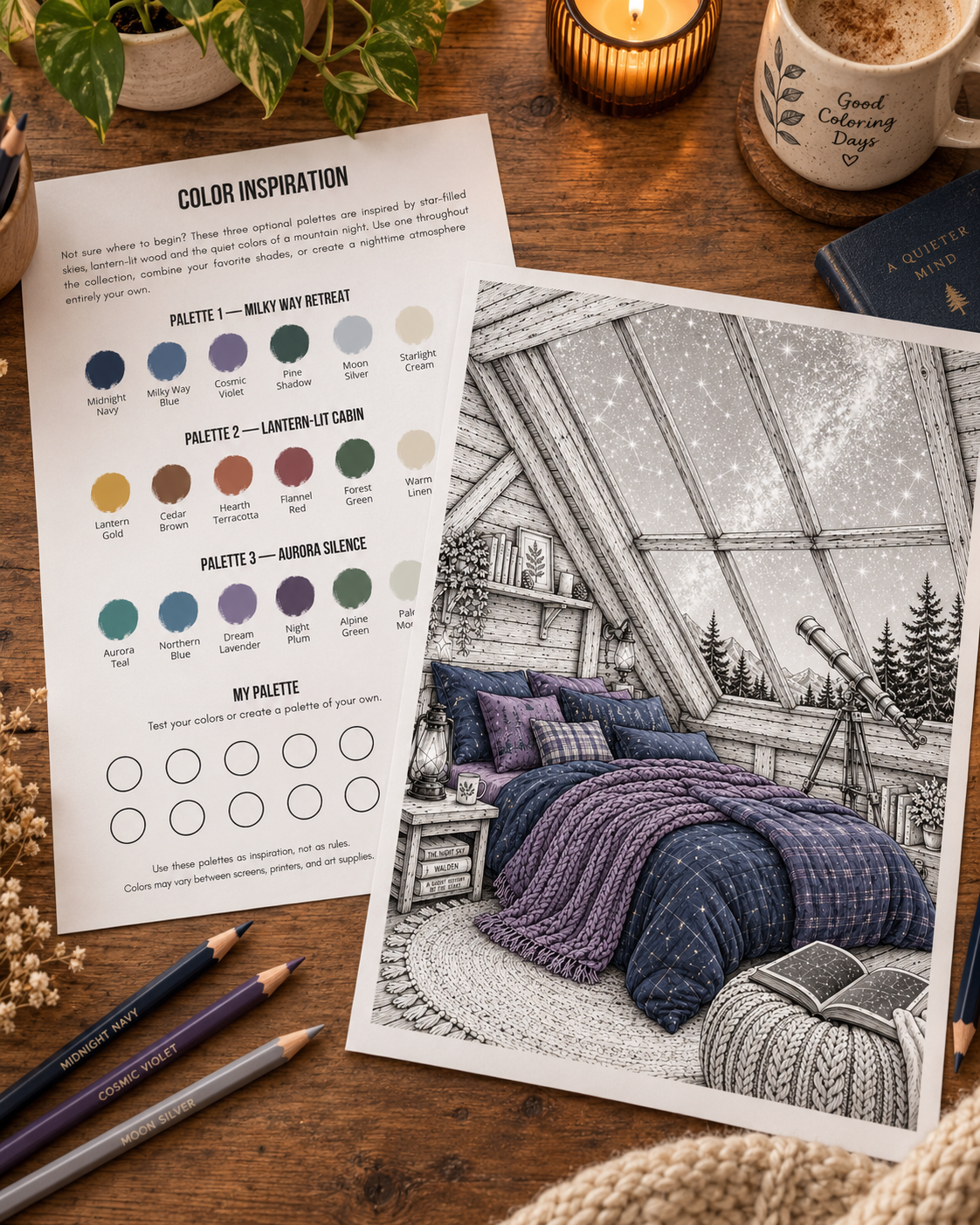
Many Midnight By Void coloring collections now include suggested color palettes designed around the specific mood of the illustrations, along with a dedicated My Palette swatch area where you can test your own pencils before starting the page.
You can follow the suggested color pairings line-for-line, borrow just two or three shades from them, or use them as a launchpad for your own custom palette.
👉 Explore Midnight By Void Coloring Pages on Etsy
Let Your Palette Simplify the Journey 🎨✨
Coloring should be a quiet, restorative retreat away from daily decisions—not another task that requires endless mental energy.
Pick a mood. Choose your single anchor color. Gather four or five pencils that feel pleasant together, test them on a small scrap of paper, and put the rest of your pencil case out of sight.
The goal isn’t to create a flawless masterpiece; it’s simply to give your hands an easy, beautiful place to begin.
Happy coloring! ☕🎨
(Want to dive deeper into the relationship between color, light, texture, and mood? Explore The Art of Atmospheric Coloring guide or browse our Cozy Palettes & Inspiration library)
Leave a Reply