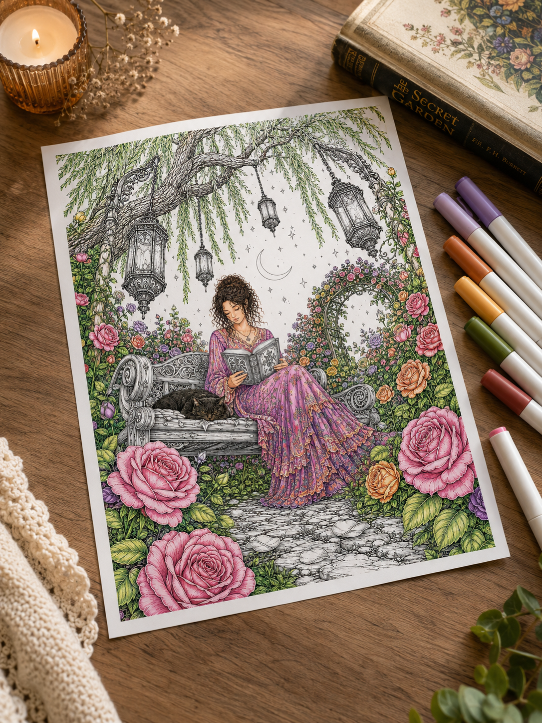
There’s something wonderfully inviting about a botanical coloring page. An overgrown doorway, roses climbing around an old bench, a greenhouse with more plants than anyone could reasonably look after. You can almost imagine spending an afternoon there.
Then you open your pencils and realize you’re about to make the same decision forty times: which green goes on this leaf?
Botanical scenes can feel surprisingly difficult to color. There’s plenty of beautiful detail, but when everything becomes a similar shade of green, the little corners you loved can disappear into the foliage. A small palette gives you somewhere to begin.
These seven botanical color palettes for greenhouses and secret gardens combine foliage colors, flowers, and useful neutrals. Each creates a different mood, from a light-filled glasshouse to a forgotten conservatory with a little dark academia charm.
Choose the one you’d most like to step into today.
🌿 Before You Begin: Give Your Colors Different Jobs
You don’t need a different pencil for every plant. Instead, choose a few colors with clear roles:
- A main foliage color for most of the leaves.
- A darker color for depth and overlapping plants.
- A flower or accent color to draw attention.
- A neutral for paths, pots, furniture, and architecture.
- A light color for softer areas and highlights.
One pencil can do more than one job. A muted brown might appear on a terracotta pot, a wooden shelf, and the shadows beneath a bench. Repeating colors helps a detailed scene feel connected. It also saves you from searching through your supplies every few minutes.
The color names below describe shades to look for in your own collection. You don’t need an exact match—or a new set of pencils.
If choosing your colors starts taking longer than the coloring itself, our guide on how to stop overthinking your coloring pages offers a few gentle ways to make that first decision easier.
🌸 1. Rose Garden Reverie
Dusty pink, sage green, deep olive, warm ivory, and weathered gray.
Imagine a quiet bench surrounded by roses, with a book waiting on the seat and petals scattered across the path. This palette feels soft and romantic, with enough muted green to keep the pink from becoming overwhelming.
Use the colors like this:
- Dusty pink: roses and a few small repeating flowers.
- Sage green: lighter leaves and delicate climbing plants.
- Deep olive: foliage behind the flowers and beneath the bench.
- Warm ivory: pale petals, cushions, or sunlit stone.
- Weathered gray: garden furniture, paving, and metal arches.
Let the larger roses carry most of the pink. Smaller flowers can stay ivory or receive just a light touch of the same shade. For more definition, deepen the folds near the center of each rose while keeping the outer petal edges lighter.
Best for: rose gardens, floral arches, reading corners, and ornate garden benches.
Try this small detail: repeat a little dusty pink on a book cover or cushion. It creates a quiet connection between the flowers and the place where someone might sit.
🪴 2. Sunlit Terracotta Greenhouse
Leaf green, forest green, terracotta, pale ochre, and cream.
This is the palette for a greenhouse that feels warm, practical, and loved. Think clay pots on wooden shelves, sunlight through the glass, and a watering can that never quite makes it back to its proper place. The warmth of terracotta gives all those greens a welcoming companion.
Use the colors like this:
- Leaf green: most of the plants.
- Forest green: shaded leaves and foliage tucked behind shelves.
- Terracotta: pots, planters, and occasional floor tiles.
- Pale ochre: wooden furniture and warm touches on stone.
- Cream: labels, pale containers, and bright open areas.
Vary your pressure or layering so every terracotta pot doesn’t look identical. Some can remain pale and softly worn, while one larger planter takes a richer color.
For the glass panes, try leaving most of the paper white. A few restrained reflections can suggest glass without filling every window.
Best for: potting benches, greenhouse interiors, herb collections, and cozy gardening scenes.
Try this small detail: place your warmest terracotta pot near the plant you want people to notice first.
🗝️ 3. The Forgotten Conservatory
Moss green, deep olive, muted teal, antique ochre, and parchment.
An old conservatory has a different kind of beauty. The metalwork is weathered, climbing plants have wandered beyond their supports, and the chair in the corner looks as though it has been waiting for someone. This palette suits that slightly melancholic, dark academia atmosphere.
Use the colors like this:
- Moss green: the main foliage.
- Deep olive: dense growth, overlapping leaves, and shaded corners.
- Muted teal: selected painted frames, pots, or decorative tiles.
- Antique ochre: aged fittings and small ornamental details.
- Parchment: stone, old books, and pale architectural surfaces.
Keep the ochre selective. A few touches on a door handle, lantern, or decorative bracket will feel more intentional than giving every metal surface the same golden treatment.
You can also soften the teal with a light layer of a compatible muted brown or gray. Test the combination on scrap paper first.
Best for: abandoned greenhouses, Gothic botanical scenes, old fountains, and hidden reading corners.
Try this small detail: leave a lighter patch around a doorway or chair so the eye has somewhere to rest among the darker plants.
💜 4. Lavender Garden at Dusk
Lavender, dusty mauve, eucalyptus green, slate blue, and pale gray.
Some garden scenes feel especially lovely when you imagine them just before evening settles in. This palette brings together soft purple flowers and cooler foliage. It works well when you want a gentle twilight mood without covering the whole background in dark blue.
Use the colors like this:
- Lavender: the main flowers.
- Dusty mauve: deeper petals and a few decorative accents.
- Eucalyptus green: leaves and climbing stems.
- Slate blue: selected shadows, distant pots, or painted furniture.
- Pale gray: paths, stone walls, and lighter architecture.
Keep lavender and mauve unevenly distributed. Choose one main flowering cluster, then repeat smaller touches elsewhere. Use slate blue sparingly at first. A little beneath a bench or behind a planter may be enough to suggest the cooler evening light.
Best for: walled gardens, lavender borders, evening courtyards, and delicate botanical scenes.
Try this small detail: leave some pale flowers nearly white, adding only a lavender shadow where the petals overlap.
🌙 5. Moonlit Secret Garden
Deep teal, midnight blue, muted violet, silver gray, and pale butter yellow.
A moonlit garden can feel mysterious without losing all its detail. The useful contrast here is between the cool garden colors and a few small warm accents. A lantern or illuminated window gives the scene a focal point.
Use the colors like this:
- Deep teal: the main foliage.
- Midnight blue: the deepest gaps and selected background areas.
- Muted violet: flowers and subtle color changes in shaded plants.
- Silver gray: paths, statues, and moon-facing edges.
- Pale butter yellow: lanterns or a small glowing window.
Begin with lighter layers than you think you need. You can deepen the shadows once you see how the scene is developing.
Avoid making every leaf equally dark. Keep some upper surfaces lighter, especially near the moon or a lantern.
Best for: hanging lanterns, moon gates, secret courtyards, and nighttime rose gardens.
Try this small detail: repeat a faint touch of yellow on the nearest stone or leaf beside a lantern. Keep it close to the light source.
Want to take this palette further? Explore how to color moonlight and night scenes without making everything too dark, with practical ways to balance cool shadows, pale highlights, and small pools of warm light.
🍂 6. Autumn Botanical Hideaway
Muted olive, rust, warm ochre, chestnut brown, and oatmeal.
A garden doesn’t have to be full of spring flowers to feel inviting. This palette suggests late-season leaves, weathered planters, and a sheltered corner where you might take a warm drink on a cool afternoon. Keeping some olive green helps the scene retain its botanical character.
Use the colors like this:
- Muted olive: the remaining green foliage.
- Rust: selected turning leaves and clay pots.
- Warm ochre: golden leaves and small accents.
- Chestnut brown: branches, furniture, and deeper shadows.
- Oatmeal: paths, pale walls, and soft furnishings.
Choose a few clusters for the rust and ochre rather than scattering both colors evenly across every plant. Let some areas stay mostly green. That variation makes the seasonal change feel more interesting.
Best for: overgrown courtyards, ivy-covered walls, garden sheds, and rustic greenhouse scenes.
Try this small detail: carry one warm leaf color into a mug, blanket, or planter near your main focal point.
🤍 7. Quiet White Garden
Soft sage, bottle green, cool gray, warm cream, and muted blush.
This palette leaves more room for pale flowers and quiet spaces. It’s a good choice when you want a garden to feel airy, even if the illustration contains plenty of detail. The darker green provides a backdrop that lets the lighter flowers stand out.
Use the colors like this:
- Soft sage: most of the lighter foliage.
- Bottle green: selected leaves behind pale blooms.
- Cool gray: shadows in white flowers and pale stone.
- Warm cream: benches, pots, and warmer petals.
- Muted blush: a few flower centers or small accent blooms.
For white flowers, leave much of each petal untouched. Add a light gray or sage shadow near the base and where one petal folds behind another.
You don’t need to outline every petal with shading. A few carefully chosen shadows can be enough.
Best for: white rose gardens, elegant courtyards, conservatory seating areas, and pale botanical compositions.
Try this small detail: keep blush to one or two small clusters for a restrained hint of warmth.
For more help with pale petals, pots, and garden furniture, read how to color white objects without leaving them blank. A few soft shadows can give white surfaces shape while keeping them beautifully light.
🎨 How to Keep All Those Greens From Blending Together
Even with a small palette, a botanical page can become busy. Before adding another green, try changing how you use the ones you already have.
Make neighboring areas lighter or darker
A pale leaf can stand out against a darker cluster even when both use the same pencil. Save deeper layers for selected overlaps, sheltered corners, and foliage behind your main subject.
Give architecture a quieter role
If the flowers and leaves carry plenty of color, keep the greenhouse frame, wall, or path relatively simple: a calm neutral area gives the eye a break.
If you’re unsure what to do with the space behind your plants, our guide on how to color backgrounds without ruining your coloring page can help you choose a background that supports the garden’s focal point.
Choose one main focal point
Decide what you want to notice first: a rose-covered arch, a chair, a fountain, or a beautiful group of pots. Give that area the clearest contrast or richest accent color. Other parts of the scene can stay softer.
Repeat your accent with intention
If your main roses are pink, try two smaller touches of pink elsewhere. You don’t have to distribute the color evenly or create a perfect pattern. Look at the page from a little farther away and see whether it feels connected.
✏️ Test a Small Corner Before Coloring the Whole Garden
You don’t need a full palette worksheet to find out whether a combination feels right. Choose one leaf, one flower, and a little piece of pot or stone, and color those three elements with your chosen shades.
Then ask yourself:
- Can I tell the flower and foliage apart?
- Do I like the neutral beside them?
- Is there enough difference between the light and dark areas?
- Would I enjoy spending more time with these colors?
If something feels off, change one color and try again.
Printable pages give you room to experiment. You can return to the same garden with warmer flowers, cooler leaves, or a completely different time of day.
🌿 Find a Little Garden to Make Your Own
If you’d like a scene to try these palettes on, explore the botanical coloring collections at MidnightByVoid on Etsy.
From rose-filled retreats to atmospheric glasshouses and forgotten conservatories, choose a setting that makes you curious to pick up your colors. Start with a flower or a few leaves beside the doorway. You can decide what happens in the rest of the garden as you go.
🌙 Choose the Garden You Want to Step Into
Some days, warm terracotta and fresh leaves feel right. Other days, you might want an overgrown conservatory in moss green and parchment, or a quiet garden beneath a violet evening sky: let the atmosphere guide your first few choices.
You can follow one of these botanical color palettes closely, swap a flower color, or work with the nearest shades you already own.
A garden full of possibilities can begin with five pencils and one small corner.
Leave a Reply