🤍 White Doesn’t Have to Mean Unfinished
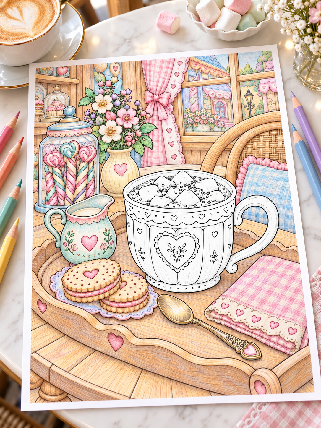
Picture this: you’re coloring a cozy café illustration. The wooden table has warm golden tones, the curtains are soft pink, and the biscuits look good enough to eat. But in the middle of the page sits a white ceramic mug. You pause, pencil in hand, wondering:
How do I color something that’s supposed to stay white?
Leaving an object uncolored can work beautifully, especially in a simple illustration. But if a white mug or blanket feels flat beside the rest of your page, a little shading can help it look more complete. White surfaces can pick up the warmth of a lamp, the coolness of window light, and subtle colors reflected from nearby objects. These variations help us see their curves, folds, and texture.
In this guide, you’ll learn how to color white objects without leaving them blank—or covering them entirely in grey. Start with a few pale shades, preserve your brightest areas, and build only as much detail as the object needs.
💡 1. Why White Objects Still Need Shadows
When you want a white object to look three-dimensional, shadows help describe its shape.
A curved mug, a folded blanket, and a rounded marshmallow might all be white, but their surfaces catch light differently. Shading helps the viewer recognize those differences.
Three ideas make this easier:
- Use shading to describe form. A soft transition can suggest the curve of a mug, while a small shadow inside a fold can give fabric depth.
- Separate the object’s color from its lighting. A white object remains white even when part of it looks cream under a warm lamp or blue-grey near a cool window.
- Avoid one uniform grey fill. A flat layer can make the object look darker without explaining its shape. Vary your shading and preserve lighter areas.
White objects can have deep shadows. What keeps them looking white is the overall relationship between their light areas, shadows, and surroundings.
Key takeaway: Start by shading the areas receiving less light and preserve the brightest parts of the paper. You don’t need to fill the entire object to give it believable form.
🎨 2. Choose a Small Palette for Your Whites
For a gentle first attempt, choose the palest shades in your collection.
You’re looking for colors that make a subtle difference beside untouched paper, rather than immediately dominating the object. Try one of these small palettes:
| White effect | Suggested colors | Example |
|---|---|---|
| Warm white | Ivory, pale warm grey, light beige | A candlelit mug or cozy blanket |
| Cool white | Pale blue-grey, cool grey, soft lavender | Snow or a white curtain near a rainy window |
| Neutral white | Very light neutral grey, slightly deeper neutral grey | White objects in soft daylight |
You don’t need every color listed. Start with one pale shade for the main shadows and a slightly deeper shade for small accents.
Test Your Colors on the Same Paper
Make a quick swatch on a spare print or a scrap of matching paper. A marker cap or pencil barrel won’t tell you exactly how the color will look on your page. Paper also affects how a color spreads, layers, and dries.
For markers, let the swatch dry before deciding whether it’s light enough.
For pencils, test the color with gentle pressure. You may already have a suitable shade—you simply need to apply less of it.
☀️ 3. Decide Where the Light Is Coming From
Before you start shading, choose a simple light source: it could be a window, a nearby lamp, or a candle. You don’t need a complicated lighting plan; one clear direction is enough for this exercise.
Then look for three things:
- Your brightest areas: Keep these lighter than the surrounding shading. On white paper, leaving some sections untouched is an easy way to preserve brightness.
- The side receiving less light: This is where you can begin adding your pale shadow color.
- Places where surfaces meet: Small contact shadows beneath a mug, between marshmallows, or inside overlapping folds can help separate shapes.
On shiny ceramic, the exact position of a bright reflection also depends on the viewing angle. For a beginner exercise, keep the highlight simple rather than trying to map every reflection.
Example: A White Mug Beside a Window
Imagine the window is on the left.
Keep much of the left side of the mug bright. Add a pale grey to the right side to suggest its curve, then deepen a few small areas beneath the rim or around the handle where appropriate.
Finally, add a small cast shadow on the table beneath the mug. That shadow helps the mug feel grounded without requiring you to darken its entire surface.
✏️ 4. A Simple Step-by-Step Method for Coloring White Objects
Use this five-step process whenever you’re unsure where to begin.
Step 1: Preserve Your Brightest Areas
Identify the sections you want to keep as untouched white paper. You don’t need to mark them. Simply decide where they are before adding color.
Step 2: Place Your Lightest Shade
Add pale grey, cream, or blue-grey to the areas receiving less light. Start small. It’s easier to deepen a faint shadow than to undo a dark one.
Step 3: Deepen a Few Small Shadows
Use your second shade beneath a rim, inside a fold, or where two surfaces meet. These small accents often do more to describe the object than another layer across the whole surface.
Step 4: Soften Transitions Where Needed
With pencils, gradually reduce pressure as you approach the white paper. With markers, work in small areas and avoid repeated passes just to chase a perfect blend. A very pale edge may look perfectly natural from a normal viewing distance.
Step 5: Step Back and Assess
Hold the page at arm’s length. Does the object have enough shape? Does it still look white? If so, you may not need more shading.
The goal is to make the form readable, not to color every available space.
🖍️ 5. How to Shade White with Colored Pencils and Alcohol Markers
Both tools can work well, but they need slightly different approaches.
With Colored Pencils
Build gentle layers. Use light pressure and increase the color gradually. Holding the pencil farther back may help you loosen your grip.
Reduce pressure toward the highlight. Let your strokes become lighter as they approach the untouched paper.
Follow the surface. Curved strokes can support the shape of a mug, while strokes following a fold can help describe fabric.
Use a white pencil if it helps. Depending on the pencil and paper, it may soften a pale transition or smooth some visible grain. Test it first and use gentle pressure. It won’t erase dark shading, and heavy application can make further layering harder.
With Alcohol Markers
Choose a very pale shade. Look for a light warm grey, cool grey, or blue-grey in your set. Color names and numbering vary between brands, so choose by a swatch on the same paper.
Keep the colored area small. Place the shade in the shadow zones and preserve your brightest sections.
Layer cautiously. Repeated passes can deepen the color and spread ink beyond the intended area. Add another layer only when the shadow needs it.
Treat the colorless blender as optional. It can soften or move some alcohol marker ink, but it doesn’t behave like an eraser. Test it first, because it may create a pale halo or spread the color.
For extra control, you can let your marker shading dry and add a little colored pencil over it.
👉 Explore this approach in How to Combine Alcohol Markers and Colored Pencils.
☕ 6. Match Your Shading to the Material
The same pale grey won’t create the same effect on every object. Pay attention to the surface you’re coloring.
White Ceramic Mugs and Teapots
Use shading to describe the curved body and small details around the rim, handle, and base.
Glossy ceramic may have a crisp highlight, while matte ceramic usually benefits from softer transitions. Keep your choices consistent with the finish you want.
Blankets and Pillows
Follow the folds with gentle shading.
Place deeper tones inside the folds and beneath overlapping fabric. Keep raised sections lighter. Avoid turning every crease into a heavy line. A few well-placed shadows can suggest softness more effectively.
Marshmallows
Think of each marshmallow as a small rounded shape.
Add a pale shadow along one side and a slightly deeper accent where it touches another marshmallow or the rim of the mug. You don’t need to outline every edge with shading. A few small differences can separate the shapes.
White Flowers
Keep much of each petal light.
Add delicate shadows near the petal bases and where petals overlap. Follow their curves so the shading supports the flower’s shape.
Snow
Preserve broad light areas and place shadows where the terrain dips, turns away from the light, or sits beneath an object.
Pale blue-grey or lavender can be useful starting colors, but adjust them to suit the lighting and palette of the scene.
🌈 7. Add a Hint of Reflected Color
White objects don’t always need grey shadows alone.
Nearby surfaces may suggest small hints of reflected color:
- A pink tablecloth can inspire a faint pink tint near the lower edge of a white cup.
- Green plants can suggest a subtle green reflection on a nearby white object.
- A blue curtain may contribute a cool note to part of a white windowsill.
You don’t have to include every possible reflection. Choose one subtle accent if it helps the object belong to the scene.
Warm Light Is a Separate Effect
A candle or warm lamp can also tint a white surface.
A little cream or pale peach on the illuminated side may suggest that warmth. This is colored light from the source rather than a reflection from a neighboring object.
Keep these colors restrained if you want the object to remain clearly white.
🖼️ 8. Use the Background to Make White Stand Out
Sometimes a white object seems unfinished because its surroundings are still blank. Before adding more shading, consider the colors beside it.
A white plate can become easier to see against a wooden table. A pale blanket may stand out once the chair beneath it is colored. A white flower can feel brighter beside green leaves.
You don’t need a dramatic dark background. Even a gentle mid-tone can provide enough contrast. Try coloring a small surrounding area, then reassess the white object. You may find it needs less shading than you expected.
👉 For more ideas, read How to Color Backgrounds Without Ruining Your Coloring Page.
⚠️ 9. Common Mistakes When Coloring White Objects
Covering Everything with One Grey
A uniform fill adds color without necessarily adding form. Preserve lighter areas and vary the shading according to the surface.
Starting Too Dark
Begin with a pale swatch and deepen only selected areas. Stronger shadows can work on white objects, but they’re easier to place deliberately once the lighter shading is established.
Ignoring the Light Direction
Random shadows can make the shape difficult to read: choose a simple light source and use it as a guide.
Drawing Every Fold with a Heavy Line
This can make soft fabric look rigid. Use gentle transitions and reserve deeper accents for a few important folds.
Using White Gel Pen as a Large Correction
A white gel pen can add small highlights, but broad coverage may leave a visible patch or a different finish. Test it first and use it sparingly.
👉 If an area becomes darker than intended, read How to Fix Coloring Mistakes Without Starting Over.
👉 For more help with volume and contrast, explore Why Your Coloring Page Feels Flat (And 7 Simple Ways to Add Depth).
🧘 10. Try a Five-Minute White Object Exercise
You don’t need to practice on an entire page.
Draw a simple mug or cushion on spare paper, or choose a small object on a duplicate print.
- Choose two shades: One very pale tone and one slightly deeper accent.
- Pick your light direction: Imagine a window on one side.
- Preserve a generous light area: For this exercise, try leaving roughly half the shape untouched. This is a starting point, not a rule.
- Add your pale shadow: Place it on the side receiving less light.
- Add one small deeper accent: Try beneath the rim, inside a fold, or near the base.
- Step back: Check whether the shape looks more rounded while still reading as white.
If it already works, stop there.
This exercise helps you discover how much you can achieve with a small amount of color.
🎁 Practice on a Printable Coloring Page
Printable coloring pages give you room to experiment.
You can test a warm palette on one copy, try cooler shadows on another, and compare the results without committing to a single version.
👉 Download 3 Free Printable Coloring Pages and choose a detail to practice shading white.
For a cozy scene featuring a mug and marshmallows, explore Cozy Candy Café in the MidnightByVoid Etsy Shop. Its café details offer opportunities to practice pale shadows, soft textures, and gentle color combinations at your own pace.
❓ Frequently Asked Questions
What Colors Should I Use to Shade White Objects?
Start with pale warm grey, light ivory, soft beige, cool grey, blue-grey, or delicate lavender. Choose one or two shades that fit the lighting and surrounding colors. Always test them on the same paper first.
Should I Leave Some of the Paper Uncolored?
Leaving white paper untouched is a useful way to preserve brightness, especially with transparent markers or light pencil layers. There’s no fixed percentage to follow. Keep your brightest areas light and adjust the amount of shading to suit the object and scene.
How Do I Keep White Objects from Looking Grey?
Avoid covering the object with one uniform tone.
Preserve lighter areas, place shadows where they describe the shape, and consider the colors around the object. Deeper shadows can still work when the overall balance makes the surface read as white.
Can I Shade White Objects with Alcohol Markers?
Yes. Start with a very pale shade tested on the same paper, place it in limited shadow areas, and preserve your brightest sections. Marker numbering differs between brands, so choose by the dried swatch rather than the label alone.
Do I Need a White Pencil or White Gel Pen?
Neither is essential when you’re working on white paper.
A white pencil may help soften some pale transitions, depending on your materials. A white gel pen can add small highlights, but neither tool reliably restores an overcolored area to untouched paper.
🤍 A Few Shadows Can Be Enough
Coloring white objects can be a small, satisfying exercise in noticing light. You don’t need to fill every section or create a flawless blend. A pale shadow beneath a rim, a gentle fold in a blanket, or a tiny accent between marshmallows may be enough to give the object shape.
The next time you reach a white detail on your coloring page, choose a light shade, preserve your brightest areas, and try a few careful marks. Then step back: you might already have everything the object needs!
Happy coloring!
Leave a Reply