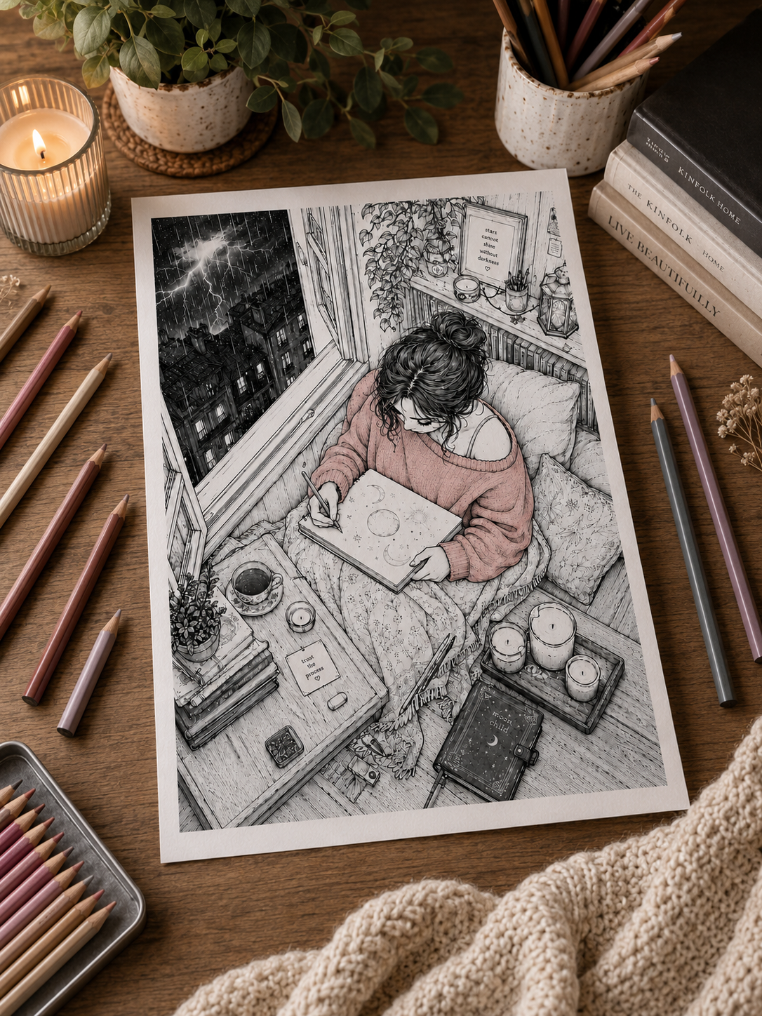
You open a new coloring book, turn to a page you absolutely love, and take in the scene: an intricate woodland village, a sprawling botanical greenhouse, or a cabin interior packed with tiny potion bottles, glowing lanterns, and woven textiles.
At first, you feel a wave of creative inspiration. But after a few seconds of looking at hundreds of tiny outlines, a different feeling creeps in: overwhelm.
Where on earth do you start? Which color goes where? How do you keep a highly detailed illustration from turning into a chaotic mess—or taking three months of exhausting work to finish?
When line art is rich and complex, it’s easy to treat the page like an intimidating test of endurance. But here is the secret: a detailed coloring page doesn’t have to become a detailed coloring session.
If you want to enjoy complex illustrations without feeling exhausted, here are 8 low-pressure techniques to make intricate pages feel approachable, relaxing, and fun again.
Before beginning a highly detailed illustration, it can help to ask whether you genuinely want a long, immersive project—or whether a more open page would feel better today. Explore the differences between Cozy Easy, Balanced and Immersive coloring styles to find the level of detail that matches your available time and focus.
When the Page Feels Too Detailed 🌿
1. Start With One Small Area 🔍
When faced with a complex page, your eyes naturally wander across the entire illustration, trying to solve the whole puzzle at once. Trying to solve the whole illustration at once can make the page feel much more demanding than it needs to be.
Zoom in, ignore a good 90% of the page and pick one tiny isolated element:
- Just a single lantern hanging on a porch.
- One small mushroom growing beside a tree root.
- A single window frame on a distant cabin.
- Two leaves tucked into a corner.
Tell yourself that coloring that one tiny area is your only goal for right now. Once you fill in that small section, the blank page stops feeling so stark, and you can decide whether you feel like continuing from there.
2. Use a 4–5 Color Palette 🎨
With dozens of pencils available, every tiny object can become another color decision. Choosing four or five colors before you begin removes many of those decisions from the session.
Eliminate the choices before you begin. Select just four or five pencils that work well together—for example, Vanilla Cream, Sage Green, Warm Ochre, Chestnut Brown, and Slate Blue.
Restrict yourself to only using those five pencils for your entire session. You’ll be amazed at how quickly you can move across a detailed page when your brain doesn’t have to re-evaluate every single color choice.
3. Separate the Page Into Visual Zones 🗺️
Instead of seeing a hundred individual objects, break the illustration down into three broad structural zones:
- Background: Sky, distant trees, mountain silhouettes, interior back walls.
- Middle Ground: Cabins, large furniture, major plant clusters, rivers.
- Foreground: Tiny details, character clothes, front-row flowers, lanterns.
Choose one zone to focus on per session. Working through an illustration layer-by-layer gives your mind a clear, structured roadmap to follow.
4. Don’t Decide Every Color Before You Begin 🧠
Many colorists get stuck because they try to color the entire page in their head before putting a single pencil to paper. They worry that choosing red for a flower on the left will ruin the curtain color they haven’t even picked out on the right.
Let go of the full masterplan! Choose the color for your first small area, color it, and then look at the page again. Let the color you just laid down inform the next choice. Color choice is a gentle conversation with the page, not a pre-budgeted architectural blueprint.
5. Leave Background Details for Later 🌌
Backgrounds can feel like giant, hungry spaces that swallow up all your time and pencil lead. If the thought of shading a huge night sky, a stone wall, or a floorboard pattern feels exhausting, simply skip it!
Color the focal points first—the cute woodland animal, the glowing window, or the main flower arrangement. If you decide later that you like the stark contrast of the white paper background, you can leave it completely untouched. You are under no obligation to fill every square inch of paper.
6. Use Repeating Colors 🌿
Intricate illustrations look far more cohesive—and take significantly less mental effort—when you repeat the same colors across different elements.
- Use the exact same green pencil for all the leaves across the entire page.
- Use the same warm ochre for all the wooden window frames, tables, and fences.
- Use the same soft grey for all the stone paths and chimney bricks.
Repeating a few core colors ties a busy, detailed illustration together naturally while saving you from constantly hunting for new pencil shades.
7. Try a 20-Minute Timer ⏳
Intricate pages can make us feel like we’re committing to a marathon. To take the pressure off, set a gentle timer on your phone for twenty minutes.
Tell yourself: “I am going to color until the timer rings, and then I am completely allowed to stop, no matter how much is done.”
The timer simply gives the session a clear stopping point. If you feel like continuing, continue. If not, twenty minutes was already enough.
8. Let Some Areas Stay Simple ✨
Not every square millimeter of a detailed page requires five-layer gradients, burnished highlights, complex textures, and specular reflections.
Save your elaborate shading techniques for one or two main focal points. For everything else—the background leaves, the small books on a shelf, the stones on a path—a flat, clean layer of single-tone color is more than enough. Keeping secondary areas simple can also help your favorite details stand out more clearly.
Stop Before You’re Tired of It 🌙
If you’re coloring because you want a quieter creative activity, there’s no reason to keep going once the page starts feeling like a chore. The moment a detailed page starts feeling like a chore or a task on your to-do list, put the pencils down.
Leave the page sitting on your desk or tucked inside your book. It isn’t going anywhere. Having a quiet, intricate world waiting for you to return to tomorrow evening isn’t a burden—It will still be there when you want to return to it.
👉 Explore Detailed Coloring Pages Designed for Unhurried Evenings
(Looking for low-pressure creative inspiration? Read our guide on 20 Low-Energy Hobbies for Quiet Evenings at Home)
When You’re Afraid of Ruining the Page 🎨
You open a fresh coloring book or print a new digital illustration. You love the line art—in fact, you love it too much.
You stare at the crisp, perfect black lines. You browse Pinterest for palette ideas. You test three different shades of blue on a scrap sheet of paper. You imagine how gorgeous it could look if you get the shading just right… and then, after twenty minutes of planning, you gently close the book or put the page away.
You didn’t color a single stroke.
If this sounds familiar, you may be running into a very familiar kind of creative perfectionism: the feeling that your first marks need to live up to the finished page already imagined in your head.
Here is the good news: a coloring page is not an irreplaceable museum artifact. It is an invitation to play.
If fear of making a mistake is keeping you from enjoying your creative time, here are 7 practical mindset shifts and coloring strategies to help you put that very first pencil mark down tonight.
1. Start With a Background Object, Not the Focal Point 🎯
When we’re afraid of ruining a page, it’s usually because we’re terrified of messing up the main subject—the cute woodland fox’s face, the main character’s dress, or the central glowing lantern.
So, don’t start there!
Put your first pencil strokes into a low-stakes, secondary object tucked away in a corner:
- A small rock at the bottom of the page.
- A single leaf in the far background.
- A tiny book sitting on a distant shelf.
- A small patch of grass.
Starting on a secondary detail takes the spotlight off your work. Once your hand gets warm and your mind settles into the motion of coloring, moving toward the main subject feels far less intimidating.
2. Test Your Palette on Scrap Paper First 📝
A lot of coloring anxiety comes from uncertainty: “What if this green looks terrible next to this brown?”
Remove the guesswork by keeping a piece of scrap paper (or a dedicated swatch sheet) right beside your coloring page. Before touching the illustration, scribble your chosen pencils side-by-side on the scrap paper.
Seeing the colors together on actual paper removes some of the uncertainty before you begin.
3. Begin With Your Lightest Color Layer 🟡
It is very difficult to ruin a page with light, sheer pressure. The panic usually sets in when we press down hard with a dark indigo or deep black right at the beginning.
Start your shading with your palest, softest tones—pastel cream, soft sage, pale peach, or light grey. Lay down a feather-light base coat across your chosen section.
Because light tones are easy to cover, adjust, or blend over, starting sheer gives you more room to adjust the color as you continue layering.
4. Accept That the First Area Doesn’t Determine the Page 🔄
When we start coloring a fresh page, the first colored object often looks strange, isolated, or harsh against the surrounding sea of stark white paper.
This is where many people panic and think: “I’ve already ruined it.”
Remind yourself of the “Ugly Stage” of art. Every painting, drawing, and colored illustration goes through an awkward middle phase where colors look unbalanced because the surrounding paper is still blank. The first area you color never looks its best until the surrounding areas are filled in too. Trust the process and keep going.
5. Keep a Backup Copy if You Color Digital Downloads 🖨️
If you color printable PDF pages, use technology to eliminate your fear entirely!
Print two copies of the page. Put one copy safely in a folder, and place the other copy on your desk.
Knowing another copy is available can make experimentation feel much lower-stakes. You are now working on a “playground copy” where you are free to experiment, make mistakes, test weird color combinations, and mess up without consequence.
6. Treat it as a Page to Experience, Not an Artwork to Preserve 🕯️
Why do we color? Is it to produce a pristine, flawless piece of gallery art to be judged by strangers? Or is it to enjoy twenty quiet minutes of screen-free relaxation at the end of a long day?
When you shift your definition of success from the outcome (a perfect picture) to the process (twenty minutes of calm), “ruining” a page becomes impossible.
Even if the final colors turn out clashing, muddy, or strange, the time you spent experimenting with them still had value. The experience doesn’t become meaningless because the finished page wasn’t what you imagined.
7. Make One Intentional “Mistake” Right Away ✏️
If perfectionism is completely paralyzing your hand, try a radical exercise: intentionally color slightly outside a line on purpose in an inconspicuous corner.
If perfectionism is keeping you completely stuck, try making one deliberately imperfect mark in an unimportant corner: let a little color cross a line, choose an unexpected shade, or leave a tiny section uneven. Then simply continue coloring. Once the page is no longer “perfect,” there is less perfection left to protect.
Breaking the spell of artificial perfection right at the start frees you from trying to maintain an impossible standard for the rest of the evening.
The Page Belongs to You 🌙
Line art is just a skeleton. It doesn’t have feelings, it doesn’t grade your work, and it doesn’t demand perfection. The page exists entirely to serve your relaxation.
Pick up your lightest pencil, pick one small background corner, lay down a soft wash of color, and let the page become whatever it wants to be tonight.
👉 Get 3 Free Printable Coloring Pages to Experiment With
(Looking for low-pressure creative guidance? Read our step-by-step tutorial on How to Color Warm Light & Cozy Glow.)
When Your Coloring Doesn’t Look Like Social Media ✨
If you scroll through Instagram, Pinterest, or TikTok for creative inspiration, you have almost certainly come across them: coloring pages that look like museum-quality oil paintings.
Pages with hyper-realistic skin shading, razor-sharp white gel pen highlights, glowing atmospheric lighting, perfectly blended prismacolor gradients, and seamless backgrounds without a single visible pencil stroke. They are often displayed under warm, aesthetic ring lights beside a perfectly styled cup of coffee and an arranged bouquet of dried flowers.
They are breathtaking to look at. But they also carry a quiet, secondary effect that nobody likes to talk about:
They can make your own quiet coloring time feel inadequate.
You look at your own page—where the pencil texture shows through the paper grain, where a shadow turned out a bit darker than you intended, or where you used six pencils instead of forty—and you think: “I’m just not very good at this.”
It’s time to take a step back and remember a simple truth: your hobby doesn’t need an audience.
What Social Media Doesn’t Show You 📸
A finished coloring post shows you the result, not necessarily everything that came before it.
You may not know:
- How Long It Took: A short video can condense many hours or multiple sessions into seconds.
- What Tools Were Used: Different pencils, markers, papers, blending tools, and editing choices can produce very different finishes.
- How Much Experience Is Behind It: Some creators have practiced illustration, coloring, or other visual arts for years.
- What Didn’t Make the Post: Swatches, experiments, abandoned attempts, and pages the creator simply decided not to share remain invisible.
You’re comparing your process with somebody else’s selected final result.y home-cooked soup to a three-star Michelin restaurant dish. They serve entirely different purposes.
The Performance Trap in Creative Hobbies 🎭
Social platforms make it very easy for a private hobby to slowly become something we think about documenting, comparing, or presenting.
If we cook a meal, we feel compelled to photograph it. If we go for a walk, we track our steps on an app. If we pick up a creative hobby, we feel a subtle, creeping pressure to document our progress, build a color-coordinated feed, or show people what we made.
When a hobby becomes a performance, it quietly stops being a hobby.
Instead of asking “Does this feel relaxing to color right now?”, we start asking “Will this look good in a photo when I’m done?”
That subtle shift introduces evaluation, judgment, and anxiety into the one space in your life that was supposed to be free from performance pressure.
Reclaiming Coloring as a Private Sanctuary 🕯️
Coloring doesn’t need to become content. It can remain tactile, quiet, unhurried, and completely private.
You don’t owe anyone a finished masterpiece. Your pages don’t need to be posted, your pencils don’t need to be professional-grade, and complex lighting techniques are entirely optional.
A page colored with a 12-pack of basic drugstore pencils while sitting in your pajamas on the couch—with visible pencil lines, simple colors, and imperfect edges—is just as valid, valuable, and meaningful as a hyper-realistic page posted to 100,000 followers.
If your simple page gave you an evening you enjoyed, it already did exactly what you needed it to do.
How to Unhook Your Creative Time From Social Media 🌙
If social media comparison is stealing the joy from your coloring time, try these quiet boundaries:
- Color Without Your Phone in the Room: Put your phone on a charger in another room so the thought of taking a photo never enters your mind while you color.
- Embrace the “Messy” Pages: Intentionally keep a coloring book where you give yourself permission to color fast, test ugly combinations, and never show a single page to anyone.
- Stop Scrolling Before You Color: Avoid browsing Instagram or Pinterest right before you open your coloring book. Enter your creative space with a fresh, quiet mind rather than a head full of other people’s artwork.
- Value the Sensation Over the Sight: Focus on how the pencil feels gliding across paper, the soft sound of shading, and the warmth of your tea, rather than judging how the picture looks.
Your Page, Your Sanctuary 💜
The next time you open a coloring page, take a deep breath and remind yourself:
This page is not an exam, is not a portfolio piece, is not content for an algorithm.
It is simply twenty quiet minutes that belong entirely to you. Color it fast or color it slow. Color inside the lines or color right across them. Use two colors or use twenty.
Make it yours, close the book when you’re done, and let that be more than enough. 🌙✨
The Page Doesn’t Need Anything From You 🌙✨
A detailed page doesn’t need to be finished tonight, and doesn’t need to stay perfect: it doesn’t need to look impressive online!
Start somewhere small. Use fewer colors if that makes the choices easier. Test something strange. Leave half the background white. Stop after twenty minutes. Close the book without taking a photo.
Coloring doesn’t have to prove that you’re creative, talented, productive, or good at following tutorials.
The page is simply somewhere you can put color for a while. So the next time you catch yourself hesitating over that first pencil stroke, ask something smaller than:
“How do I make this beautiful?”
Try:
“What would be fun to color first?”
Start there. 🎨🌙
👉 Explore Cozy Screen-Free Living Articles
(Looking for quiet, low-pressure creative escapes? Browse Midnight By Void Printable Coloring Pages)
Leave a Reply