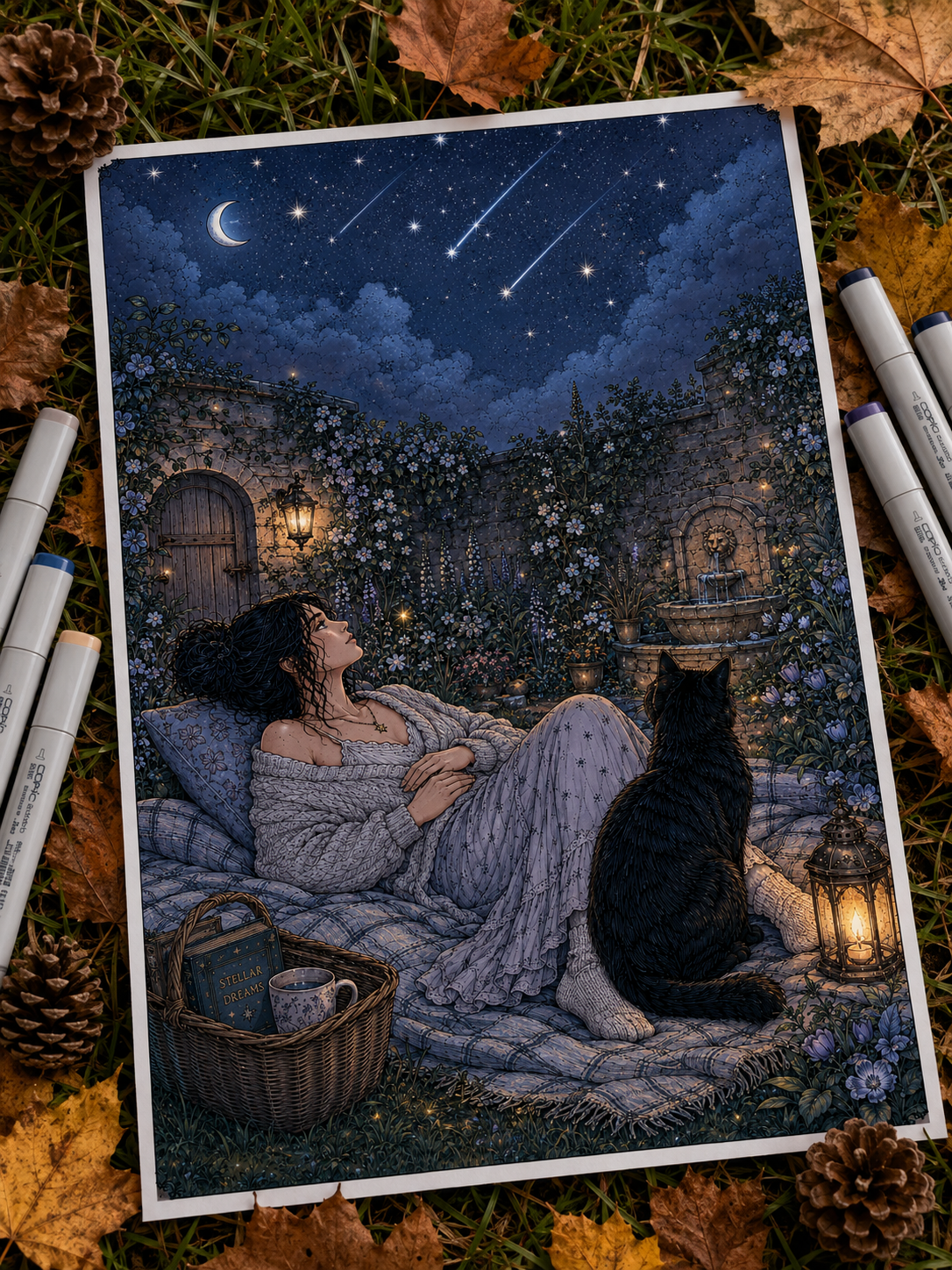
Night scenes can be some of the most atmospheric coloring pages to work on—but they also come with one very common problem: how do you make a scene look dark without coloring everything black?
The answer is: contrast.
A convincing night scene still needs visible color, clear shapes, dimensional highlights, and separation between the foreground and background. Instead of simply making every object darker, you can shift your colors cooler, reduce their brightness selectively, preserve moonlit areas, and let a few carefully chosen highlights carry the atmosphere.
If you’re wondering how to color night scenes or create believable moonlight, these techniques will help you build darkness while keeping your page detailed, readable, and full of color. 🌙
1. Decide What Kind of Night You’re Coloring 🌌
Before choosing your pencils or markers, decide on the overall mood. Not all nights look or feel the same! Establishing your environment first makes choosing a cohesive palette much easier:
- Clear Moonlit Night: Cool blue, silver-grey, muted violet, deep navy.
- Warm Summer Night: Deep teal, muted forest green, dusty indigo, soft amber accents.
- Misty Night: Blue-grey, lavender, soft slate, pale ice blue.
- Cozy Autumn Evening: Rich indigo, deep plum, charcoal, warm gold highlights.
- Magical Fantasy Night: Sapphire, vibrant violet, turquoise, pale silver.
Decide on the atmosphere first—the palette becomes much easier to manage afterward, preventing you from automatically reaching for standard black and dark blue.
2. Don’t Replace Every Daytime Color With Black 🖤
One of the most important rules for rendering nighttime is to darken the original color instead of erasing it. An evergreen tree doesn’t suddenly turn black at midnight, and a red roof doesn’t vanish into the dark.
Instead of covering objects in pure black, shift their hues into deeper, cooler versions of themselves:
- Green Foliage: Shift to deep forest green, blue-green, or muted teal.
- Beige Stone & Walls: Shift to cool taupe, muted lavender-grey, or slate blue.
- Red Roofs & Brick: Shift to burgundy, muted plum, or deep brown-red.
- Brown Wood: Shift to dark indigo-brown, walnut, or cool charcoal.
Keeping subtle traces of local color is what prevents a night scene from flattening into one dark mass.
3. Build Darkness With Cool, Layered Colors 🌙
Rather than relying on black, build shadow depth using a palette of rich, cool darks:
- Deep Indigo
- Slate Blue
- Blue-Grey
- Muted Violet
- Deep Teal
- Cool Charcoal
- Deep Plum
Pure black can certainly be useful, but reserve it for specific accents: the deepest crevices, sharp silhouettes, or focal-point contrast. Pure black does not need to carry the entire night scene on its own!
4. Keep Moonlit Areas Lighter Than You Think 🌕
Moonlight works best when you preserve light areas from the beginning instead of trying to recover them after everything is already shaded dark.
Before applying your shadows, identify what the moonlight can actually reach:
- The tops of rooflines and porches.
- The upper curves of leaves and branches.
- Pathways, cobblestones, and footbridges.
- Shoulders and heads of characters.
- Mountain ridges and water surfaces.
Use paper white, pale blue, silver-grey, or soft lavender for these lit surfaces. The high contrast between these pale highlights and your cool background shadows is what creates a glowing lunar effect.
5. Use Edge Light to Separate Shapes ✨
If you shade a dark tree against a dark night sky, the tree will disappear. The secret to keeping objects distinct in the dark is rim light (or edge lighting).
Add a narrow, pale edge—using pale blue, silver, or cream—along the side of an object facing the moon. Apply this selectively to:
- Tree trunks and major branches.
- Hair or animal fur.
- Rooftops and chimney edges.
- Stone walls and cliff faces.
- Overlapping leaves.
A few carefully chosen illuminated edges are far more effective than outlining every single object on the page.
6. Create Depth by Making the Distance Softer 🏔️
Nighttime doesn’t mean every layer of an illustration should share the exact same darkness. Use atmospheric perspective to create depth:
- Foreground: Darkest overall values, sharpest contrast, and crispest details.
- Middle Ground: Muted mid-tones with medium contrast.
- Background: Lighter, softer, and more desaturated.
In a moonlit mountain scene, nearby pine trees might be rendered in deep teal and indigo, while distant mountain peaks fade into soft lavender or blue-grey.
7. How to Color a Moonlit Forest 🌲🌙
Woodland night scenes are full of charm, but foliage can easily turn into a muddy mess if not approached systematically:
- Tree Canopy: Layer deep forest greens with indigo shadows rather than flat black.
- Leaves Facing Moonlight: Use muted blue-green, sage, or pale silver highlights on top.
- Tree Trunks: Blend cool brown, taupe, and indigo-brown.
- Forest Floor: Keep areas under dense foliage dark, but let moonlight pool onto open paths, rocks, or clearing grass.
- Misty Air: Apply pale blue-grey or lavender sheerly across distant trunks.
(Coloring leaves and foliage in your night scene? See our How to Shade Plants guide for more ideas on botanical depth and leaf textures.)
8. Mix Moonlight With Warm Windows & Lanterns 🏡✨
Night scenes become exceptionally cozy when you pair cold moonlight with warm interior lighting:
Cool Moonlight → Indigo · Slate
Warm Light → Cream · Amber
Keep the landscape cool using deep indigos and slate blues, then place concentrated warm colors—vanilla cream, golden yellow, and amber—strictly around windows, lanterns, or fireplaces. A tiny warm window becomes infinitely brighter when surrounded by a cool night landscape.
(Want to master the warm side of that contrast? See our full guide on How to Color Warm Light & Cozy Glow)
9. How to Color Moonlight on Water 🌊🌙
Moonlight reflecting across a lake, sea, or puddle should never be rendered as a single solid white line. Water moves continuously, causing light to break apart.
- Broken Highlights: Use horizontal, scattered streaks of silver-blue, pale lavender, and white.
- Distant Water: Keep reflections narrow near the horizon.
- Foreground Water: Widen the reflection as it comes closer to the viewer.
- Deep Water: Surround the golden or silver reflection with deep teal, navy, or indigo ripples.
(For more details on ripples, reflections, and water surfaces, see our guide on How to Color Water)
10. How to Color the Moon Without Making It a Flat White Circle 🌕
Whether full or crescent, the moon should remain one of the brightest objects on your page:
- Full Moon: Preserve mostly white or pale cream in the center. Add subtle, soft textures using pale silver-grey or delicate lavender. Avoid heavy dark grey craters, which can make the moon look dirty.
- Crescent Moon: Keep the inner crescent brilliant white, and shade the surrounding sky dark enough to create a sharp silhouette.
- Lunar Glow: Add a sheer, subtle pale blue or lavender halo extending slightly into the sky immediately surrounding the moon.
11. Make Stars Small Enough to Feel Bright ✨
A common mistake is filling a night sky with massive white circles, which can look like falling snow or confetti.
To create a natural star-filled sky:
- Vary the sizes—make most stars tiny, needle-point dots.
- Keep stars clustered sparsely rather than perfectly evenly spaced.
- Use a white gel pen or acrylic paint pen for crisp opacity.
- Add an occasional four-point sparkle star only on the very brightest celestial points.
A few bright stars surrounded by plenty of quiet sky feel far more luminous than hundreds of large, identical dots.
12. Use Silhouettes Selectively 🌲
Silhouettes create dramatic focal contrast in night scenes. Foreground elements—such as overhanging tree branches, a roofline, a distant mountain ridge, or grass blades—can be rendered near-black to frame the composition.
However, use silhouettes sparingly! If every object turns into a black shape, you lose the intricate line art details that made the coloring page enjoyable in the first place.
13. Add Magical Glow Without Losing the Night ✨
If your night page features fantasy elements—like glowing crystals, bioluminescent mushrooms, fireflies, or magical lanterns—remember the golden rule of glow: every light source needs darker surroundings to appear luminous.
Keep the ground, cave walls, or forest floor cool and deep, allowing your neon or pastel glow pigments to pop off the paper.
(Coloring magical crystals or glowing cave details? See our step-by-step guide on How to Color Crystals Like Magic)
Quick Night-Scene Cheat Sheet 🌌
| Element | Recommended Night Tones |
| Sky | Indigo, slate, deep blue, muted violet |
| Foliage | Deep teal, blue-green, dark forest green |
| Stone & Brick | Cool grey, lavender-grey, slate |
| Wood | Cool brown, indigo-brown, taupe |
| Moonlight Highlights | Pure white, pale blue, silver-grey |
| Warm Windows/Lamps | Vanilla cream, honey gold, amber |
| Water Reflections | Deep navy base + broken pale silver streaks |
Night Color Palettes to Try 🌙
Silver Moonlight
Pale Blue · Slate · Indigo · Silver Grey
Cozy Cabin Night
Deep Indigo · Dusty Blue · Amber · Vanilla Cream
Misty Forest
Blue Grey · Muted Sage · Lavender · Deep Teal
Midnight Garden
Dusty Rose · Plum · Forest Green · Moonlit Blue
Magical Night
Sapphire · Violet · Turquoise · Pale Silver
Common Night Coloring Mistakes to Avoid ⚠️
- ❌ Coloring Everything Black: Erases details and flattens the drawing; preserve local colors by shifting them cooler.
- ❌ Making Every Shadow Equally Dark: Deprives the scene of atmospheric depth.
- ❌ Forgetting Light Direction: Ensure all moonlit highlights face the moon’s position.
- ❌ Adding Pale Rim Light Everywhere: Keep rim lighting selective so it remains effective.
- ❌ Making the Sky One Flat Color: Add soft gradients (e.g., deeper near the top, slightly lighter near the horizon).
- ❌ Making Every Star the Same Size: Vary dot sizes and spacing for natural scatter.
- ❌ Overusing Warm Light: Limit warm amber/gold tones to light sources so cool shadows retain their contrast.
A Simple Night-Scene Formula to Remember 🌙
Local color → cooler shift → layered shadows → moonlit highlights → small accents
Coloring night is about preserving contrast, not eliminating light. Keep enough variation between objects for the scene to remain readable, then place your brightest highlights only where they matter most.
Ready to Color After Dark? 🌙🏡
Moonlit mountain trails, forest cabins, quiet shelters, and evening landscapes are perfect for experimenting with cool shadows, silver highlights, glowing windows, and atmospheric night palettes.
👉 Explore Mountain & Cabin Coloring Pages on Etsy
Prefer magical glow, crystals, and stranger worlds after dark? Explore Fantasy Coloring Pages on Etsy.
Let the Darkness Leave Room for Color 🌙✨
A night scene doesn’t need to disappear into black. Keep traces of the original colors, shift them cooler, build your darkest shadows selectively, preserve the surfaces touched by moonlight, and let small highlights guide the eye across the page.
A pale roof edge, a silver reflection on water, a glowing cabin window, or a few tiny stars may be all you need to make the darkness feel convincing.
Next time you open a nighttime coloring page, don’t start by asking: How dark should everything be?
Ask instead: Where is the light still visible?
Build the night around that answer. 🌙✨
(Not sure which world to explore tonight? Find Your Coloring Escape and pick a page that matches your mood.)
Happy coloring!
Leave a Reply