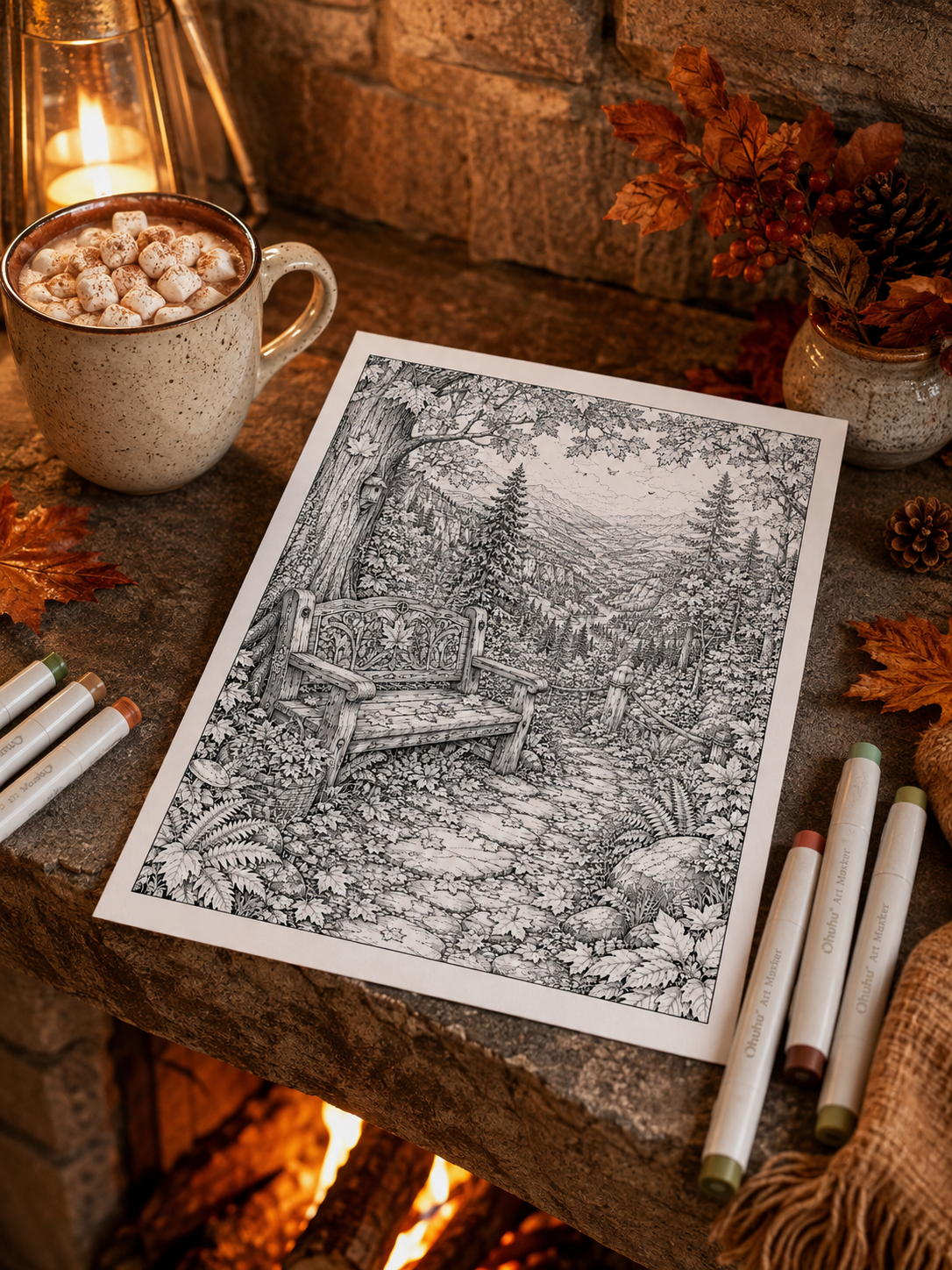
You sit down with a beautiful autumn coloring page, open your pencil case—and reach for the same burnt orange, golden yellow, and chocolate brown pencils you used last time.
It is an easy habit to slip into: If your autumn coloring palettes always seem to begin with burnt orange, golden yellow and chocolate brown, you are definitely not alone. Burnt orange and rich brown are classic fall colors for a reason: they bring to mind pumpkin patches, fallen leaves, old wooden cabins, and warm cinnamon tea. But they do not have to dominate every page in your book.
Autumn in the real world is so much broader and more atmospheric than a single palette. It encompasses stormy grey skies, wet glass windows, dark winterberries, deep evergreen pines, faded garden roses, lingering morning mist, and pale golden sunlight filtering through chilly air.
Changing your palette is one of the easiest ways to give a familiar illustration a completely different personality. Whether you use colored pencils, alcohol markers, or digital brushes, the seven combinations below move beyond the expected without losing the warmth, nostalgia, and quiet atmosphere that make fall so comforting. 🌿🍁
You do not need the exact brands or shades shown here. Treat each palette as a direction rather than a strict recipe: choose the closest colors you already own, test them together, and adjust anything that does not feel right.
Quick start: Pick one dominant color, two or three supporting colors, and one small accent. You can build an atmospheric page with only five shades.
How to Build an Autumn Palette That Still Feels Cohesive
Before exploring the palettes, it helps to understand how colors can share a detailed page without competing for attention. A useful starting point is the 60–30–10 rule:
- 60% Dominant Color: Establishes the primary mood and background environment.
- 30% Supporting Colors: Builds variety, surface textures, and physical depth across the scene.
- 10% Accent Color: Draws the viewer’s eye directly to primary focal points and highlights.
For example, in a rainy village scene, a stormy slate blue might cover 60% of the page (sky, rooftops, and wet cobblestone reflections). Moss green and stone grey act as the 30% supporting environment, while a vibrant lantern amber occupies just 10% of the page—concentrated strictly inside illuminated windows and lamps.
You do not need to measure these percentages precisely. The idea is simply to let one color family lead, allow a smaller group to support it, and save your strongest contrast for the details you want people to notice first.
Try This Before You Begin
Make five small swatches on scrap paper and place them beside the uncolored page. If one shade seems much brighter or warmer than everything else, decide whether it should become your intentional accent—or replace it before you start.
1. Rain-Washed Village 🌧️
A quiet, reflective, and slightly nostalgic palette for overcast days.
- Stormy Blue (
#526776): Sky, roof slates, and wet cobblestone reflections. - Mist Grey (
#BBC0BC): Stone walls, morning fog, and soft highlights. - Moss Green (
#68735A): Overgrown vines, potted plants, and damp lawn edges. - Muted Burgundy (
#793F49): Weathered brick, autumn leaves, and shop awnings. - Lantern Amber (
#D29A4A): Glowing windows, streetlamps, and warm interiors.
Coloring Tip: Use Stormy Blue and Mist Grey as your dominant base tones, then reserve Lantern Amber for windows and lamps. The contrast between cool rainy shadows and warm glass will make the light feel especially inviting.
Featured Escapes: Perfect for bringing pages from Autumn Village After Rain or Rain on Glass to life.
2. Moonlit Apothecary 🔮
Mysterious, magical, and quietly luxurious.
- Midnight Teal (
#244D52): Dark wood shelves, night sky, and ambient shadows. - Deep Plum (
#593A59): Velvet curtains, antique rugs, and rare potion ingredients. - Dusty Mauve (
#9B7185): Dried botanical bundles, soft cushion highlights, and book covers. - Antique Gold (
#B68A4C): Brass scales, metallic labels, candle frames, and highlights. - Old Parchment (
#DED0AE): Spellbook pages, scroll paper, and label backgrounds.
Coloring Tip: Resist the temptation to make every potion bottle a different bright color. Repeating the same five shades across glass, books, labels, and fabrics creates a more intentional antique atmosphere.
Featured Escape: Designed specifically for scenes like Harvest Moon Apothecary.
3. Faded Harvest Market 🧺
Rustic, gentle, and sun-faded.
- Soft Sage (
#98A081): Market stall wood, herb crates, and pale leaves. - Wheat Cream (
#D8C89D): Linen aprons, woven baskets, and dried corn husks. - Muted Terracotta (
#B8654F): Clay pots, hearth tiles, and rustic brick. - Dried Cranberry (
#8B4650): Apple crates, berry jams, and autumn floral accents. - Deep Olive (
#596044): Shaded foliage, structural beams, and ground shadows.
Coloring Tip: Use terracotta only as a secondary supporting color. Allowing soft sage, wheat cream, and deep olive to dominate 70% of the page makes the harvest scene feel naturally sun-bleached and beautifully vintage.
Featured Escape: Captures the cozy, rustic charm of Woodland Harvest Market.
4. Forest After Rain 🌲
Earthy, cool, and deeply restorative.
- Deep Pine (
#294B43): Evergreen canopies, deep forest shadows, and mossy bark. - Eucalyptus (
#789083): Fern highlights, pale leaves, and mist-covered foliage. - Mushroom Taupe (
#978D80): Tree stumps, dirt paths, and fungal caps. - Fog Grey (
#C8CBC5): Distant mist, river rocks, and overcast sky. - Wild Berry (
#81495B): Small forest berries, cozy scarves, cabin doors, and accents.
Coloring Tip: Alternate between cool teal-greens (Deep Pine) and warm olive-greens across different plant layers to prevent foliage from flattening out. Use Wild Berry sparingly on small berries or clothing details to create eye-catching focal points.
Featured Escapes: Bring depth to Autumn Forest Trails, Autumn Hideaway, or Enchanted Mushroom Village.
5. Alpine Autumn Morning 🏔️
Fresh, peaceful, and quietly uplifting.
- Mountain Blue (
#758B9C): Distant peaks, clear morning sky, and cool wood shadows. - Fir Green (
#3F5D4E): Pine needles, window shutters, and forest ridges. - Chalet Cream (
#E2D6BC): Carved wooden logs, stone paths, and morning light. - Muted Mustard (
#C09B4E): Golden larch trees, glowing lanterns, and sunlit grass. - Rosewood (
#7E4C4A): Roof shingles, balcony flowerboxes, and cozy textiles.
Coloring Tip: Apply Mountain Blue not only to the sky, but also lightly into the shadows on pale stone and light wood logs. Unifying your shadows with a single cool hue ties mountain landscapes together seamlessly.
Featured Escape: Ideally suited for alpine landscapes like Autumn in the Alpine Village.
6. Botanical Autumn Glasshouse 🌿
Lush, peaceful, and slightly melancholic.
- Dusty Fern (
#68775D): Indoor ferns, monstera leaves, and potted plants. - Smoky Jade (
#456962): Glasshouse iron frames, deep shadows, and palm leaves. - Faded Rose (
#AD7476): Wilting petals, terracotta pots, and autumn leaf edges. - Glass Blue (
#A5BCC0): Condensation on window panes, sky reflections, and water drops. - Soft Brass (
#AE8A55): Watering cans, metal fixtures, and warm light accents.
Coloring Tip: Autumn plants do not all turn orange at once. Keep most of the greenhouse dusty green, then suggest the changing season through a few faded rose leaves, foggy glass reflections, and cooler morning light.
Featured Escapes: Perfectly matched for Botanical Glasshouse, Plant Sanctuary, or After the Rain.
7. Rose Garden at Twilight 🌹
Romantic, moody, and dreamlike.
- Dusty Rose (
#B47A80): Late-blooming roses, garden cushions, and sunset clouds. - Wine Red (
#713B4B): Deep rose shadows, velvet ribbons, and rich flower cores. - Muted Olive (
#727456): Rose stems, arbor leaves, and garden lawn. - Twilight Blue (
#58657A): Evening sky, stone benches, and ambient shadows. - Moonlit Cream (
#DED6C2): Lantern glass, stone pathways, and soft highlights.
Coloring Tip: Use Twilight Blue for all your background shadows instead of neutral grey or black. The cool blue undertones preserve the soft, romantic atmosphere of a twilight garden without muddying your rose pigments.
Featured Escapes: Beautiful for romantic pages like Tea in the Rose Garden or Midnight Rose Garden.
How to Choose the Right Palette for Your Page
If you are choosing between several combinations, look at the largest areas in your illustration first. A page filled with sky and stone will respond differently from one dominated by foliage, fabric, or warm interior details.
| If your page includes… | Try this palette |
|---|---|
| Rain, cobblestones, or glowing windows | Rain-Washed Village |
| Potions, candles, or moonlight | Moonlit Apothecary |
| Markets, pumpkins, or dried flowers | Faded Harvest Market |
| Trails, mushrooms, or hidden cabins | Forest After Rain |
| Chalets, fir trees, or mountain streets | Alpine Autumn Morning |
| Greenhouses, houseplants, or wet glass | Botanical Autumn Glasshouse |
| Roses, gazebos, or twilight gardens | Rose Garden at Twilight |
What If the Palette Doesn’t Match Your Pencils Exactly?
Do not worry if your pencil case does not contain an exact match for Smoky Jade or Wheat Cream. The swatch names and hex codes are visual directions, not strict rules.
Select the closest equivalent shades you already own. The exact pencil brand matters far less than preserving the relationship between your dominant, supporting, and accent colors.
Before committing marker or pencil to your illustration, test the shades on scrap paper or on the My Palette swatch page included in many Midnight by Void printable collections. Seeing the colors side by side makes it much easier to spot one that feels too bright, too cold, or disconnected from the rest.
And if your first combination does not work? Change it. A palette is a starting point, not a promise you have to keep.
Want to Create Your Own Atmospheric Palettes? 🎨
These seven combinations are only a starting point. If you would like to understand how color temperature, lighting, and contrast can completely change the mood of an illustration, explore The Art of Atmospheric Coloring—a practical guide to building richer palettes and creating believable light, texture, and atmosphere.
👉 Explore The Art of Atmospheric Coloring
Start With a Free Creative Escape 🌿
Download three free printable coloring pages, choose one of the palettes above, and discover how a familiar autumn scene can transform completely through color.
👉 Download 3 Free Coloring Pages
Autumn does not belong to only two colors. It can be slate blue like rain on cobblestones, deep pine like a quiet forest path, plum like an apothecary at midnight, or dusty rose like the last garden light before winter.
Choose the palette that feels most like the season you need today—and let the page become your version of autumn. ☕🍁✨
Leave a Reply