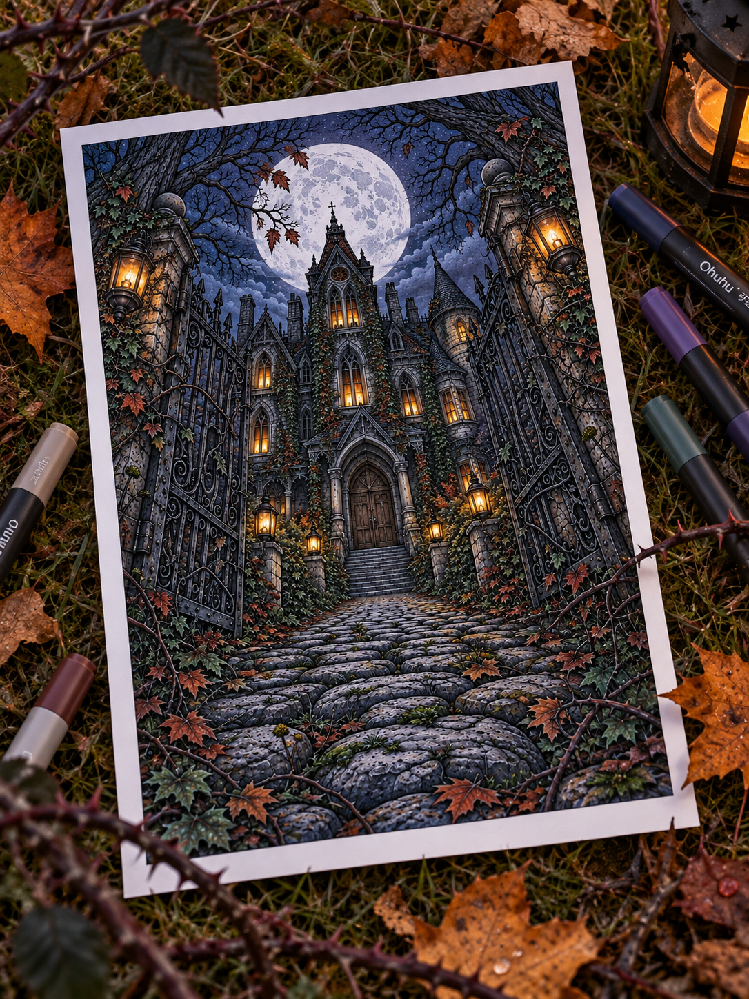
A creaking Victorian porch surrounded by overgrown ivy. A flickering candle reflecting in a cracked gilt mirror. A towering abandoned manor silhouetted against a swollen October moon.
Spooky autumn scenes are some of the most atmospheric, storytelling-rich pages to color. But they also come with a unique technical challenge: how do you capture an eerie, gothic mood without turning the whole page into a muddy blob of flat black?
When every shadow is pure black and every object is bright orange, the page quickly loses its depth, delicacy, and cozy atmosphere. The secret to rendering a hauntingly beautiful Halloween scene is balancing cool gothic shadows, warm glowing focal points, textured decay, and a carefully controlled palette.
If you’re ready to bring abandoned manors, fog-laced gardens, and candlelit autumn nights to life, here is your complete guide to coloring spooky scenes that remain detailed, readable, and full of atmosphere! 🎃✨
1. Start With the Mood: Cozy Spooky vs. Full Horror 🕯️
Before picking up your pencils, decide what kind of spooky mood you want to create.
Are you aiming for a visceral, terrifying horror aesthetic, or a cozy gothic escape? The Midnight By Void style thrives in that sweet spot of atmospheric cozy-spooky: think of forgotten libraries, crackling fireplaces in dusty parlors, raven perches, harvest moons, and overgrown pumpkin patches at dusk.
When you view the scene as an atmospheric story rather than a scary jump-fright, your color choices naturally lean toward rich, romantic, and nostalgic tones.
2. Build a Limited Halloween Palette 🎨
A common mistake when coloring Halloween pages is relying strictly on two colors: harsh pumpkin orange and flat black.
To give a spooky scene real sophistication, build a richer 6-color palette that includes warm harvest accents, deep cool shadows, and soft antique neutrals:
Deep Plum · Moss Green · Burnt Orange · Antique Gold · Charcoal · Warm Cream
This combination allows you to capture classic autumn elements while surrounding them with mysterious, weathered gothic tones.
A carefully chosen palette can make the same spooky scene feel cozy, mysterious, romantic or genuinely unsettling. If you need a place to begin, these 7 gothic autumn color palettes include ready-made combinations for haunted houses, moonlit gardens, candlelit rooms and other atmospheric Halloween scenes.
3. Use Dark Colors Without Flattening the Page 🖤
When rendering an abandoned room or a dark forest at night, avoid using pure black across large areas. Heavy black pencil flattens line art, erases background details, and absorbs all light.
Instead, build your darkest shadows using rich, desaturated darks:
- Deep Indigo: Perfect for night skies and shadows on stone.
- Plum & Deep Violet: Ideal for velvet curtains, wallpaper shadows, and decaying blooms.
- Dark Walnut Brown: Great for old furniture, wooden floorboards, and overgrown vines.
- Charcoal Grey: Excellent for wrought iron, chimney soot, and roof tiles.
Save pure black strictly for tiny, high-contrast accents—like the center of an eye, a raven’s beak, or a deep keyhole crease.
4. Keep Moonlight Cool 🌙
In a haunting outdoor scene, moonlight provides the primary cool contrast to indoor candle warmth.
Never color a moonlit sky solid dark blue and call it a day. Keep the surfaces catching direct moonlight pale and luminous using paper white, soft silver-grey, or delicate lavender. Trace a narrow silver-blue rim-light along the edges of roof gables, gravestones, tree branches, and wrought-iron gates facing the sky.
(If you want to make moonlit scenes feel softer and more believable, read our full guide on How to Color Moonlight & Night Scenes Without Making Everything Too Dark)
5. Use Warm Light as the Contrast 🏮
What makes a haunted manor feel inviting rather than bleak? Glowing warm light.
Tuck vibrant, warm light sources into strategic spots across the page:
- A single glowing window in a dark attic.
- An antique brass lantern resting on a porch step.
- A cluster of dripping wax candles on an old wooden altar.
Keep the core of the flame or light bulb pale cream, building outward into honey gold and warm amber. The sudden jump between cold indigo outdoor shadows and warm golden interior light creates instant atmospheric magic.
(Working on lanterns and fireplaces? Explore our tutorial on How to Color Warm Light & Cozy Glow)
6. Make Decay Look Interesting 🧱🪵
Gothic architecture and abandoned autumn settings are full of aged, weathered surfaces. Instead of coloring a wall or fence in one flat shade, embrace texture:
- Weathered Wood: Blend taupe, grey-brown, and muted olive to make planks look sun-bleached and worn by rain.
- Cracked Brick & Stone: Use cool grey base coats with touches of dusty violet in the mortar lines to create an antique, crumbling feel.
- Rust & Patina: Add tiny flecks of burnt sienna or rust orange to iron gates, and touches of pale teal to aged copper roofs.
- Old Fabrics: Render worn curtains or faded carpets using desaturated dusty rose or muted sage.
(Coloring old architecture? Pair your techniques with our guides on How to Color Wood and How to Color Brick & Stone)
7. Color Autumn Vegetation Without Making Everything Orange 🍂
Overgrown gothic gardens and haunted forest paths should feature a wild mix of decaying botanical tones. If every leaf and pumpkin is electric orange, the focal points of your page will blend into the background.
Balance bright autumn leaves with muted seasonal foliage:
- Muted Olive & Sage Green
- Deep Burgundy & Wine Red
- Warm Ochre & Raw Umber
- Dusty Terracotta
Using rich ochres and muted olives for background vines lets a few select bright-orange pumpkins or red leaves pop off the page like glowing gems.
(Looking for more seasonal leaf combinations? Read Best Colors for Autumn Coloring Pages)
8. Use One Focal Glow 🔮
In a complex, highly detailed spooky scene—such as a grand parlor packed with cobwebs, books, portraits, and furniture—it’s easy for the eye to get lost.
Choose one primary light source to dominate the scene. Make the attic window the brightest point, or concentrate your strongest gold highlights around a central candelabra. Let the light fade gradually as it moves toward the outer edges of the page, allowing background corners to sink softly into shadow.
9. Let Some Areas Stay Quiet 🌌
Dramatics work best when surrounded by quiet spaces. If every single corner of your coloring page features maximum contrast, sharp highlights, and intense shading, the illustration becomes visually exhausting.
Allow secondary elements—like background wallpaper patterns, floorboards, or distant trees—to remain simple. A flat or gently blended mid-tone in background areas creates a place for the eye to rest, making your detailed focal points stand out effortlessly.
10. Finish With Small Spooky Details ✨
Once your primary light, shadows, and textures are established, bring in the tiny micro-details that complete the story:
- Candle Wax Drips: Shade the sides of melting candles with soft cream and pale taupe shadows.
- Cobwebs: Trace fine, light-grey lines across window corners or dark wooden beams.
- Ravens & Birds: Use dark charcoal with a subtle sheen of deep indigo on the wing tops.
- Cracked Glass: Keep mirror or window glass pale grey, adding dark charcoal lines inside the cracks.
3 Cozy-Spooky Palette Ideas 🎨
Keep these three tested color combinations nearby for instant gothic inspiration:
Haunted Harvest Manor 🎃
Burnt Orange · Burgundy · Olive · Charcoal · Antique Cream
Moonlit Gothic Garden 🌙
Indigo · Dusty Violet · Moss Green · Silver Grey · Pale Gold
Abandoned Candlelit Interior 🕯️
Walnut Brown · Faded Rose · Ochre · Deep Plum · Warm Ivory
(Want to learn how to adapt these formulas to other pages? Read How to Choose a Coloring Palette When You Have No Idea Where to Start)
Want a Spooky Autumn Scene to Practice On? 🎃
Explore Haunted Autumn Manor, a printable collection of detailed coloring pages filled with decaying Victorian rooms, overgrown gardens, glowing lanterns, candlelit interiors, a forgotten cemetery, and a haunted manor beneath the October moon.
👉 Explore Haunted Autumn Manor on Etsy
Let the Atmosphere Tell the Story 🕸️✨
Don’t think that coloring a spooky autumn scene is just about covering the paper in heavy black pencil. It’s about building a mood: balancing the chill of a moonlight night with the inviting warmth of a single candle flame, and giving old wood, stone, and fallen leaves room to breathe.
Start with your cool shadows, choose one warm focal glow, keep your autumn foliage varied, and let the old textures tell the story. Little by little, your page will begin to feel less like a Halloween illustration and more like a place you could step into.
Happy spooky coloring, and stay cozy! 🎃🍁🕯️
Leave a Reply