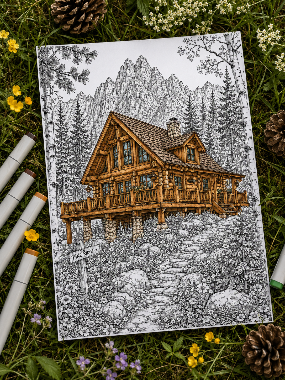
Wood appears almost everywhere in coloring pages, but it can be surprisingly easy to make it look flat. Filling an entire plank with one solid shade of brown usually removes the very thing that makes wood so inviting and tactile: variation.
Real wood is full of subtle changes in color, grain direction, knots, worn edges, ambient shadows, and tiny imperfections.
If you’re wondering how to color wood, the good news is that you don’t need dozens of brown pencils or complicated techniques. A few layered tones, a controlled blending hand, and carefully placed grain lines can completely change the texture.
Here are the techniques you can use for cabins, furniture, fences, bridges, tree stumps, shelves, and other rustic wooden details. 🪵
1. Don’t Start With “Brown” — Start With the Type of Wood 🪵
Before picking up a single pencil, ask yourself what kind of wood you want to create. There is no single “wood brown“— Natural wood can range from pale creams and golden beige to deep chocolate browns, cool grey-browns, and almost-black tones.
- Warm & Cozy Wood: Honey, caramel, chestnut, warm ochre
- Dark & Rustic Wood: Walnut, espresso, mahogany, deep umber
- Light & Natural Wood: Beige, soft tan, pale ochre, cream
- Weathered & Aged Wood: Taupe, grey-brown, muted olive, charcoal
- Autumn Wood: Warm ochre, burnt sienna, rust, deep brown
Key Mindset Shift: Instead of asking “Which brown pencil should I use?”, ask “What kind of wood am I trying to create?”
2. Build the Base With More Than One Color 🎨
A convincing wooden surface contains several related colors rather than one perfectly even base. If you fill a log with a single shade, it can easily start to look flat or overly uniform.
Instead, build a four-layer gradient:
- Light Base: A pale undertone laid down sheerly with light pressure.
- Warm/Cool Mid-Tone: The main body color that defines the overall character of the wood.
- Deep Shadow Tone: Tucked into corners, joins, and undersides.
- Highlight: Preserved paper space or a warm cream accent along raised edges.
Example Base Sequences:
- Honey Wood: Cream → Golden Ochre → Caramel → Warm Brown
- Dark Walnut: Soft Tan → Chestnut → Walnut → Espresso
Let small areas of the lighter base remain visible beneath your shading. This creates natural color variation before you even start drawing grain lines!
3. Follow the Direction of the Grain 🪵
This is the single most crucial rule for coloring wood: your pencil strokes must mimic the structural direction of the wooden object.
- Flat Planks & Tabletop: Long, straight, horizontal or diagonal parallel strokes.
- Vertical Posts & Fence Slats: Up-and-down vertical strokes.
- Round Cabin Logs & Branches: Slightly curved strokes that wrap around the cylinder.
- Tree Stump / Cross-Section: Concentric, irregular circular rings radiating outward.
- Wooden Door: Panels often shift grain directions (e.g., vertical center, horizontal top frame).
The grain should describe the 3D shape of the object, not just sit on top of it like a printed pattern.
4. Make Wood Grain Look Natural, Not Striped ✏️
A common beginner mistake is drawing perfectly parallel, solid dark lines like zebra stripes:
||||||||||||.
Real wood grain is organic, irregular, and imperfect. To render natural-looking grain:
- Alternate between long lines, short interrupted strokes, and subtle curves.
- Vary your hand pressure so lines fade in and out.
- Leave some sections of the wood almost completely free of grain.
- Use a slightly darker version of your mid-tone color for grain lines, rather than jumping straight to black or dark espresso.
Avoid drawing every grain line continuously from one edge of the plank to the other. Real wood grain splits, fades, and occasionally vanishes.
5. Add Knots Without Making Them Look Like Bullseyes 🌀
Knots are lovely rustic features, but a perfectly circular black dot looks like a target pasted onto the plank.
Here is how to render natural wood knots:
- Start With an Irregular Center: Draw a tiny, teardrop or oval-shaped dark center (using walnut or espresso).
- Flow the Grain Around It: Curve your surrounding grain lines around the knot, like water flowing around a stone in a stream.
- Darken One Side: Add a subtle crescent shadow on one side of the knot to give it a to give it a little more depth.
- Keep the Outer Edge Soft: Blend the surrounding grain so the knot feels integrated into the tree’s natural growth pattern.
Think of a knot as something the grain flows around rather than a dark circle placed on top of the wood.
6. Use Light and Shadow to Give Wood Depth ✨
Wood texture and overall lighting work together. A wooden tabletop isn’t just brown—it reacts to surrounding light sources!
In cozy scenes, warm light can bring out beautiful color shifts in wooden surfaces:
- Lit Edges: A nearby lantern or fireplace turns wooden edges into honey, amber, or warm ochre.
- Shadow Sides: The side of a log facing away from the light shifts into cool, desaturated tones like slate brown, indigo-brown, or muted violet.
Working with glowing windows, lanterns, or candlelight? See our full guide on How to Color Warm Light & Cozy Glow.
7. How to Color Weathered & Aged Wood 🌧️
Weathered wood—like old bridges, barn doors, mountain shelters, and rustic fences—requires a completely different palette. As wood is exposed to sun, rain, moisture, and changing weather, its original color can fade and shift toward softer, greyer, more desaturated tones.
- Palette: Taupe, Grey-Brown, Muted Olive, Charcoal Brown
- Technique: Keep your pressure uneven. Use short, scratchy strokes instead of smooth circular blends.
- Details: Add tiny vertical splits, worn grey edges and faded areas where the surface has been exposed to weather, and touches of muted green moss near ground level.
Weathered wood often looks much more convincing when you remove saturation rather than simply making the brown darker.
Coloring an old cottage or mountain shelter? Pair your wood textures with our guide to Coloring Brick & Stone.
8. How to Color Smooth or Polished Wood 🪑
Indoor furniture—like library bookshelves, dining tables, cabinets, and shiny wooden floors—requires a softer touch than outdoor logs.
- Fewer Grain Lines: Keep grain lines subtle and sparse.
- Smooth Blending: Burnish your layers with a white pencil or colorless blender to soften visible paper texture and create a smoother finish.
- Clean Highlights: Leave a a clean, gently blended highlight band where light reflects from the polished surface.
Rustic wood relies heavily on rough texture. Polished wood relies more on smooth gradients and controlled reflections.
9. Give Every Plank Slight Variation 🏡
If you are coloring a cabin wall made of twenty wooden logs or a floor made of ten planks, do not use the exact same color mix on every single board!
Keep the same general palette, but tweak each plank slightly:
- Make one plank slightly darker with chestnut.
- Make the next plank warmer with honey ochre.
- Add a prominent knot to one board, and keep the next one smooth.
- Darken the recessed joins between the boards using espresso or deep indigo.
Small shifts in value and temperature make individual planks clearly visible without turning the wall into a patchwork of unrelated colors.
10. Add Tiny Signs of Age and Story 📖
The charm of cozy, hand-drawn art lies in the small, imperfect details that suggest a lived-in history:
- Worn Edges: Keep railings, chair arms, and stair steps lighter where repeated use might gradually lighten or wear the surface.
- Grooves & Gaps: Push dark shadows into the cracks between floorboards or log joins.
- Natural Touches: Add tiny flecks of green moss along the bottom of damp fence posts, or soft water stains near rain gutters.
A few thoughtful imperfections make wood feel far more convincing than dozens of perfectly drawn grain lines.
If you want to go beyond simple brown shading, The Art of Atmospheric Coloring explores how value, texture and temperature work together to make wood feel warmer, older, smoother or more weathered. It also includes focused practice exercises you can print and repeat. [Explore the full guide + practice pack →]
How to Color Different Wooden Surfaces 🪵
Keep this quick reference guide handy for your next project:
- Cabin Logs 🏡: Warm chestnut base + dark recessed grooves + honey gold top highlights.
- Wooden Bridge 🌉: Weathered taupe/brown + dark gap shadows + lighter, worn plank edges.
- Polished Furniture 🪑: Smooth gradients + soft caramel/walnut tones + subtle, clean highlights.
- Rustic Fence 🪵: Uneven vertical strokes + faded grey top tips + occasional mossy green bases.
- Tree Stump 🌲: Radial rings curving outward + irregular bark cracks + dark outer shadow rim.
- Cozy Bookshelves 📚: Warm mid-brown + deep indigo shadows tucked under shelves + gentle front-edge glow.
Cozy Wood Palettes to Try 🎨
Cozy Cabin
Honey Gold · Caramel · Chestnut · Espresso
Weathered Cottage
Warm Taupe · Grey Brown · Muted Olive · Charcoal
(Planning a seasonal autumn scene? Read our guide on 7 Cozy Autumn Coloring Ideas)
Autumn Woodland
Golden Ochre · Burnt Sienna · Rust · Dark Walnut
Quiet Interior
Cream · Soft Tan · Walnut · Dusty Mauve
Common Wood Coloring Mistakes to Avoid ⚠️
- ❌ Using One Brown for Everything: A single pencil shade flattens the 3D surface.
- ❌ Drawing Perfectly Parallel Grain Lines: Looks like striped fabric rather than natural timber.
- ❌ Making Every Knot a Dark Circle: Creates distracting “eyes” across the page; keep them irregular!
- ❌ Ignoring the Shape of the Object: Grain strokes must follow the contours of the log or plank.
- ❌ Making Every Plank Identical: A cabin wall needs slight shifts in tone between individual logs.
- ❌ Using Pure Black Between Every Board: Using heavy black between every board can overpower a softer, more natural palette. Try deep brown, charcoal, or indigo first for recessed shadows.
A Simple Wood Formula to Remember 🪵
Base Tone → Color Variation → Grain → Knots → Shadows & Highlights
When in doubt, follow this simple sequence. Believable wood comes from variation: shift the tone slightly, break up the grain, and let light interact naturally with the surface.
Ready to Practice Rustic Wood Textures? 🏡🪵
Cabins, wooden bridges, hiking shelters, forest fences, and cozy furniture are perfect for experimenting with layered browns, natural grain, weathered surfaces, and warm highlights.
👉 Explore Mountain & Cabin Coloring Pages on Etsy
Prefer golden leaves, wooden cottages, and seasonal forest details? Explore Autumn Coloring Pages on Etsy.
Let the Wood Tell a Little Story 🪵✨
Coloring wood isn’t about finding the perfect brown pencil. It’s about creating small variations—a lighter edge here, a darker groove there, an imperfect knot, a plank faded by weather, or a warm reflection catching the edge of a table from a nearby lantern.
Start with a simple light base, follow the direction of the grain, and build texture gradually instead of trying to draw every single line at once. Whether you’re coloring a tiny forest cabin, an old footbridge, a bookshelf, or a weathered cottage door, those small irregularities are what help the surface feel textured, lived-in, and believable.
And remember: wood doesn’t have to be perfect to look beautiful. In cozy scenes, a little wear and variation often makes it even better.
Happy coloring! 🪵✨
(Not sure which world you want to build tonight? Find Your Coloring Escape and pick a page that speaks to you!)
Leave a Reply