Sometimes, the hardest part of coloring is deciding where to begin.
You like the page, you have your pencils nearby… but you are still wondering whether those crystals would look better in cool blues or warm pinks, or whether an autumn scene could work just as beautifully after dark.
These are some of the questions I have been exploring with AI here at Midnight by Void.
I use AI as part of my creative process, including developing coloring illustrations and exploring visual ideas for the blog. In this article, I want to show one specific part of that process: using AI-assisted previews to compare palettes, lighting, and atmosphere.
If you have seen the same scene appear in different moods on the blog or on Pinterest, this is a look behind those images—and a few ideas you can take back to your own coloring table ☺️.
💭 Why I explore different versions of a coloring page?
A black-and-white illustration leaves a lot open!
A window could hold pale morning light or the warm glow of a room at night. A cluster of crystals could feel icy, earthy, or almost candy-colored. Snow can pick up lavender shadows, peach reflections, or the soft gray of an overcast afternoon.
I enjoy exploring those possibilities because choosing colors can feel surprisingly restrictive when you are trying to get everything “right”.
Seeing a few alternatives gives you something concrete to respond to. You might like the cooler shadows but prefer the warmer focal point. You might realize that the dramatic version is interesting to look at, while the softer one is what you actually feel like coloring.
That reaction is useful. It helps you discover what you want from the page.
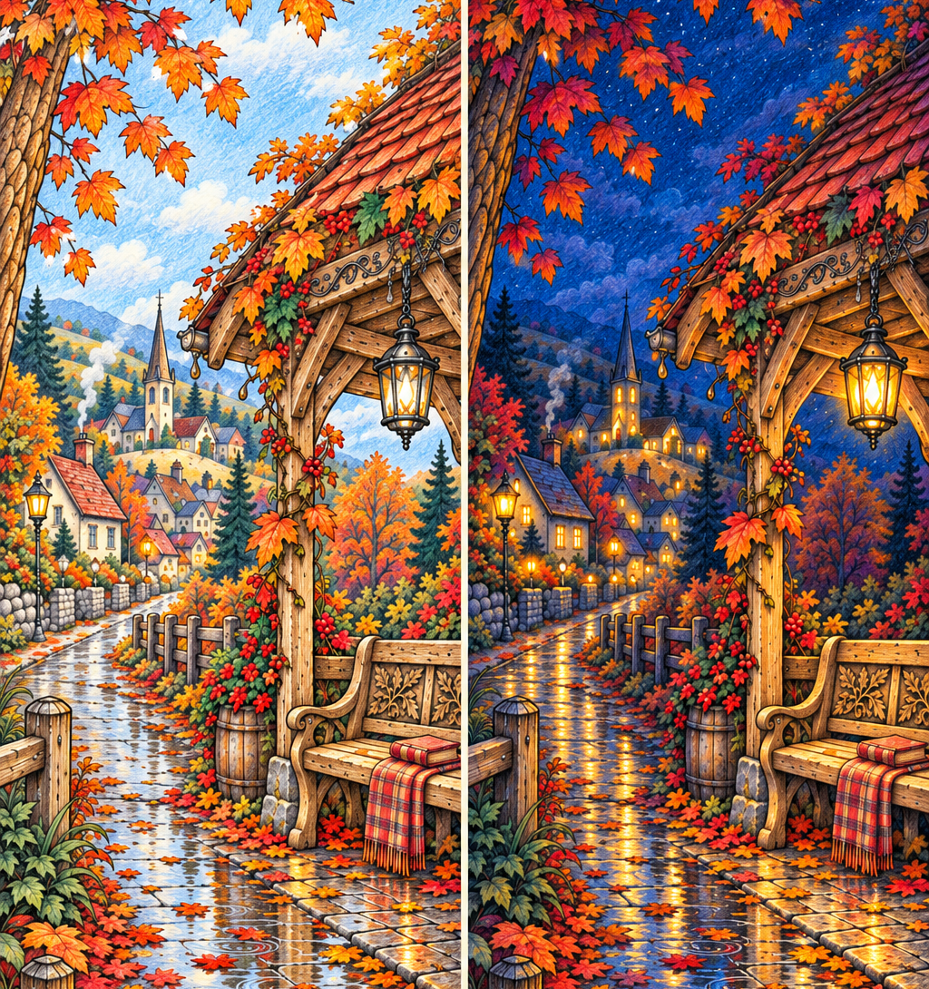
🍂 One autumn scene in daylight and after dark

One recent experiment started with an autumn illustration and a simple question: how different could the same scene feel in daylight and at night?
For the daytime interpretation, the idea was to explore warmer foliage and a lighter overall atmosphere. For the nighttime version, the focus shifted toward cooler surroundings and the contrast of warm light against the dark. The interesting part is how those choices change the scene’s emotional emphasis. You may notice the landscape first in one version and the feeling of shelter in the other.
If you want to try a similar experiment on paper, you do not need to color the whole page twice. Test a small section: one window, a patch of foliage, and a little background. Compare the two combinations before choosing a direction.
An AI-assisted preview can suggest the mood: your small color tests can help you find a version that works with the supplies you have.
🔮 Two different directions for the same crystals

Another experiment focused on the crystals within an illustration.
The idea was to compare two color directions while keeping attention on the same element. This makes it easier to see how a palette changes the character of an object without asking the viewer to take in an entirely different scene.
For your own page, you could explore blue, turquoise, and violet for a cooler interpretation, or rose, peach, and mauve for something warmer. You can also look beyond the color names. Where are the lightest areas? How much contrast separates neighboring facets? Does the crystal stand out from its surroundings?
Those questions give you more to work with than simply trying to find a pencil that matches a screen.
There is also a practical limitation: AI may change small details, shapes, or lighting even when asked to preserve them. A generated variation needs checking before it can serve as a useful comparison.
🌨️ Exploring snow beyond white and blue

Snowy scenes are another lovely place to experiment.
A blue-and-white palette is one option, but I wanted to explore other atmospheres too: warmer light, softer shadows, and different relationships between the snow and the buildings around it.
These previews can help you notice possibilities you might otherwise overlook. A warm window may feel more inviting against muted violet shadows. A pale peach sky may suggest a quieter mood than a strong blue one. On paper, you can start very small: leave much of the snow as the white of the page and try a little color in a few shadow areas. See how it feels before adding more.
The preview is a starting point for that decision, rather than a set of colors you have to reproduce exactly.
🤖 What an AI preview can and cannot show
An AI-generated image can help communicate a color relationship or an imagined atmosphere. It cannot establish how a particular pencil, marker, or paper will perform.
A grainy digital finish may resemble colored pencil without showing real pencil marks. A luminous highlight may depend on a digital effect that is difficult to recreate with your materials. The image may also contain inconsistent shadows or details that need correcting.
That distinction matters when looking at coloring inspiration online.
An AI-assisted palette example is a visual suggestion. A photograph of a hand-colored sample shows a result achieved with actual materials. Both can be useful, but they answer different questions.
When I share an AI-assisted example, it should be clear that it is an imagined interpretation, rather than evidence that I completed that result by hand. A texture that looks convincing on screen is not, by itself, a tested coloring technique.
💡How an idea becomes a useful comparison
For these experiments, the starting point is a specific question: daylight or nighttime? Cool or warm crystals? What happens if the snow reflects a different sky? Keeping that question narrow makes the comparison easier to understand.
The next step is reviewing the result. Did the illustration change? Is the lighting coherent enough to explain the idea? Are the colors distinct enough to offer a meaningful choice?
A visually impressive image can still be unhelpful if the original scene has changed too much or the effect is difficult to interpret. The part I want to bring to the blog is that selection and explanation: what the experiment reveals, where it falls short, and how you might adapt the idea for your own page.
🎨 Try a small palette experiment yourself
You do not need AI to use this approach.
Choose one part of a coloring page and make two small groups of swatches. Keep the number of colors manageable, then give each group a direction: misty morning, warm evening, moonlit garden, or whatever suits the illustration. Test both on a small area or a spare printout, and notice which one makes you want to keep going.
You can borrow a color relationship from an image without matching every shade or texture. If a reference gives you the idea of warm light against cool surroundings, that may be all you need from it.
❤️ Want a few pages to experiment with?
My free collection includes 10 printable coloring pages across different themes, so you can try a palette, explore a different mood, or simply choose a scene that suits your evening ☺️
Sign up to receive the free collection, choose one page, and start with a small area. There is no need to plan every color before you begin.
👉 Claim your 10 free coloring pages now
💕 More possibilities for your next coloring session
What interests me about these experiments is seeing how much room a single illustration leaves for interpretation. I can share two versions of a scene, and you might immediately imagine a third. You may prefer fewer colors, softer shadows, or a completely different season.
That is what I hope these examples offer: a little help getting past the blank page, followed by the freedom to make your own choices.
Which would you like to see explored next: a moonlit greenhouse, warmer winter colors, or another crystal palette? Let me know! ☺️
Leave a Reply