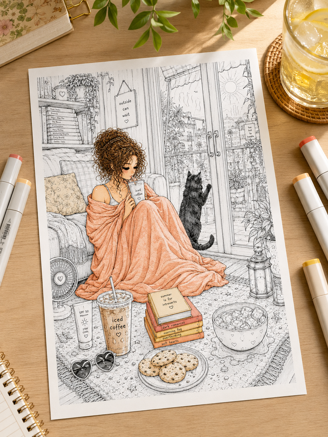
A folded blanket on an armchair. A soft sweater. Heavy curtains beside a glowing window. A knitted scarf wrapped around a woodland animal.
Fabric appears almost everywhere in cozy coloring pages, but different materials shouldn’t all look the same. A wool blanket needs a soft, slightly fuzzy texture. Satin relies on smooth, strong highlights. Linen looks matte and slightly irregular, while velvet becomes convincing through deep shadows and rich color shifts.
If you’re wondering how to color fabric, the key is not drawing every individual thread. It’s understanding how the material folds, catches light, and changes texture.
Here are simple, effective techniques for coloring blankets, clothes, cushions, curtains, knitted fabrics, velvet, plaid, and other cozy textiles. 🧶
1. Start With the Fabric, Not the Color 🪡
Before picking up a pencil or marker, ask yourself one crucial question: What material am I trying to create?
The exact same red pencil will produce completely different results depending on how you shade the surface:
- Cotton: Soft, matte finish with gentle, smooth gradients.
- Wool: Soft-edged, textured, and slightly fuzzy.
- Linen: Matte, natural, with subtle, irregular surface variations.
- Velvet: Deep, rich shadows, high color saturation, and dramatic contrast.
- Silk & Satin-Like Fabrics: Smooth surfaces with clean highlights and stronger shifts between light and dark.
2. Find the Folds Before You Start Shading 🌀
Fabric isn’t flat—it sags, bunches, stretches, and drapes. Before applying your dark colors, look at the linework to identify five key elements: ridges, valleys, overlapping folds, stretched areas, and compressed areas.
Follow this core lighting structure for folds:
Raised Fold → Side Plane → Deep Crease
Light → Mid-Tone → Shadow
Instead of asking “Where should I add dark color?”, ask “Where does the fabric fold away from the light source?”. Deep creases usually receive less light, while the rounded tops of folds tend to catch brighter highlights.
3. Follow the Direction of the Fabric ✏️
Just like tree bark or flower petals, your pencil strokes should generally follow the physical movement of the material:
- Curtains & Drapes: Long, continuous vertical strokes.
- Folded Blanket: Curved strokes following the contour of each fold.
- Sleeves & Legs: Wrapping strokes that curve around the limbs.
- Cushions & Pillows: Gentle outward curves extending toward seams and corners.
Let your strokes describe the 3D volume of the object rather than sitting on top of the drawing like a flat layer of color.
4. Build Soft Folds With Three Values 🧺
A simple, reliable way to render fabric is using a three-value palette: Light Base + Mid-Tone + Deep Shadow.
- Dusty Rose Blanket: Blush Pink Base → Dusty Rose Mid-Tone → Mauve Shadow
- Sage Cushion: Pale Sage Base → Olive Sage Mid-Tone → Forest Grey Shadow
Apply a light base layer first. Use medium pressure to shade into the sides of the folds, reserving your darkest tone strictly for deep, recessed creases. Don’t make every fold equally dark; shallow ripples need soft shadows, while tucked-under folds require deeper contrast.
5. How to Color Blankets & Cushions 🛋️
Blankets
To make blankets feel soft and inviting, keep your gradients broad and your highlights diffused. Avoid harsh, sharp edges. For thick knitted throws, push dark shadows deep between the heavy folds; for lightweight cotton sheets, keep your value transitions subtle and gradual.
Cushions & Pillows
Think of a cushion as a soft, inflated shape rather than a flat square:
- Keep the central pillow area slightly lighter to show volume.
- Deepen the shadows along the tufted creases and outer edges.
- Add subtle highlights along the rounded, stitched seams.
6. How to Color Knitted & Wool Textures 🧶
You don’t need to draw thousands of tiny yarn hairs to make wool look soft!
- Color the entire item with a soft base coat.
- Build your light and shadow folds as you would for cotton.
- Suggest wool texture using short, broken, feather-light strokes along the edges of the clothing or blanket.
- Add a few tiny, lighter fiber strokes on the illuminated edges.
For knitted patterns, follow the existing linework: shade the small gaps between the stitches to create depth, and leave the raised loops lighter. Texture should support the form rather than hide it.
7. How to Make Velvet Look Rich ✨
Velvet can show surprisingly strong shifts between deep shadows and rich, luminous areas because its surface reacts to light differently depending on the direction of the fibers.
- Plum Velvet: Dusty Mauve → Rich Plum → Deep Burgundy → Indigo Shadows
- Forest Velvet: Sage Highlight → Emerald → Forest Green → Deep Teal Shadows
Compared with a matte cotton surface, velvet can often handle a wider range between its darkest shadows and brightest areas.
8. How to Color Silk & Satin 🎀
Satin can appear exceptionally smooth and reflective, so its highlights are usually cleaner and more concentrated than those on cotton or wool.
Dark Shadow → Mid-Tone → Bright Highlight → Mid-Tone
- Keep visible paper texture subtle by using smooth layering or gentle burnishing.
- Create narrow, concentrated highlight bands along the crest of each fold.
- Keep the contrast clean and direct—satin looks shiny because its light-to-dark transitions are crisp and concentrated.
9. How to Color Plaid, Stripes & Fabric Patterns 🟥🟩
A common pitfall is coloring patterns as if they were printed on a flat sheet of paper. When a blanket or shirt folds, its pattern must bend too!
- Follow the Curves: Stripes and plaid grids should curve across folds and compress inside deep creases.
- Shade the Pattern Together: Apply your light and shadow layers over the entire plaid pattern. A red stripe sitting inside a deep shadow fold should be darkened just as much as the green box next to it.
Classic Autumn Plaid Palette: Cream · Rust · Forest Green · Dark Brown
10. Let Nearby Light Change the Fabric 🕯️
Fabric can pick up some of the color from nearby light sources. A blue blanket beside an amber lantern won’t suddenly become yellow, but the illuminated folds may shift slightly warmer while the deeper creases remain cooler.
- Lit Surfaces: Add a warm, golden overlay on raised folds facing a lamp or candle.
- Shadow Surfaces: Keep deep creases cool by adding hints of indigo, slate, or muted violet.
Working with candlelight, lanterns, or glowing windows? See our full guide on How to Color Warm Light & Cozy Glow.
11. How to Color Clothes on Characters & Animals 🦊
When coloring outfits on cozy character illustrations, focus on compression points where the fabric naturally bunches up:
- Behind the elbows and knees.
- Under the arms and around the waist.
- Where aprons, belts, or scarves cinch the material.
Keep heavy coats structured with firm, broad shadows, while keeping sweaters soft with feathered, gentle shading.
(Coloring furry friends underneath those cozy clothes? Check out our guide on How to Color Animal Fur)
12. Add Tiny Textile Details Last 🪡
Build the volume of your fabric first, and add decorative micro-details second:
- Stitching lines along seams.
- Blanket fringe and tassels.
- Embroidery patterns.
- Subtle wear marks on elbow patches or knees.
Adding details after establishing your lights and darks helps your textile textures remain dimensional and readable.
Cozy Fabric Palettes to Try 🎨
Autumn Plaid 🍂
Cream · Rust · Forest Green · Dark Brown
(Planning a quiet fall scene? Explore our guide on 7 Cozy Autumn Coloring Ideas)
Sage Cottage 🌿
Ivory · Sage · Olive · Warm Taupe
Midnight Cozy 🌙
Dusty Blue · Deep Teal · Plum · Charcoal
Warm Neutral 🤎
Cream · Oatmeal · Camel · Walnut
Woodland Sweater 🦊
Mustard · Moss Green · Terracotta · Burgundy
Quick Fabric Cheat Sheet
| Material | Surface Texture | Shading Approach |
| Cotton | Matte & smooth | Broad, soft gradients |
| Wool | Fuzzy & textured | Broken strokes & soft edges |
| Linen | Subtle & earthy | Slightly irregular, low contrast |
| Velvet | Deep & plush | Saturated colors & high contrast |
| Satin | Slick & reflective | Crisp highlights & sharp value jumps |
| Knits | Loop-patterned | Shadows tucked between raised stitches |
Common Fabric Coloring Mistakes to Avoid ⚠️
- ❌ Shading the Outlines Instead of Folds: Makes clothes look flat and paper-like.
- ❌ Making Every Crease Equally Dark: Shallow ripples need lighter shadows than deep folds.
- ❌ Adding Surface Texture Too Early: Build the main form and shading before adding wool loops or stitches.
- ❌ Coloring Every Fabric the Same Way: Differentiate cotton from satin using contrast and highlight sharpness.
- ❌ Keeping Plaid Lines Straight Across Folds: Patterns must curve and compress with the material.
A Simple Fabric Formula to Remember 🧶
When coloring any textile, follow this five-step sequence:
Fabric Type → Fold Direction → Light & Shadow → Texture → Fine Details
Convincing fabric begins with the folds, not the surface texture. Make the material feel three-dimensional first, then add the details that show whether it’s wool, cotton, velvet, or satin.
Ready to Practice Cozy Fabric Textures? 🧶🦊
Sweaters, aprons, blankets, cushions, curtains, and tiny woodland outfits offer endless opportunities to experiment with soft folds, knitted textures, plaid patterns, and warm seasonal palettes.
👉 Explore Cozy Woodland Animal Coloring Pages on Etsy
Prefer blankets, cabins, warm interiors, and autumn plaids? Explore Autumn Coloring Pages on Etsy.
Let the Fabric Feel Soft Before You Add Details 🧶✨
Coloring fabric isn’t about drawing every individual thread. It’s about understanding how material moves: where it rises, where it folds inward, where light catches the surface, and where shadows gather between layers.
Start with the shape. Build your light and shadow. Then decide whether the surface needs the fuzzy softness of wool, the natural texture of linen, the deep richness of velvet, or the clean highlights of satin.
Next time you color a blanket, sweater, curtain, or cushion, ask yourself: How is this fabric folding?
Let that answer guide everything else. 🧶✨
(Looking for your next creative project? Find Your Coloring Escape and pick a cozy world to color tonight.)
Leave a Reply